|
Color test for the armors. I am drawn to the more muted ones. Since the point of this was to experiment with shapes, using muted colours or a monochromatic scheme would make it more about the shape and silhouette. A final version will appear in my gallery, so this will be the last post on this particular piece. 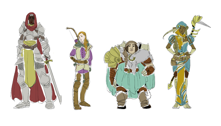 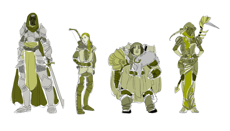 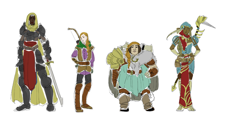 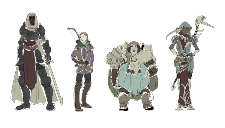
0 Comments
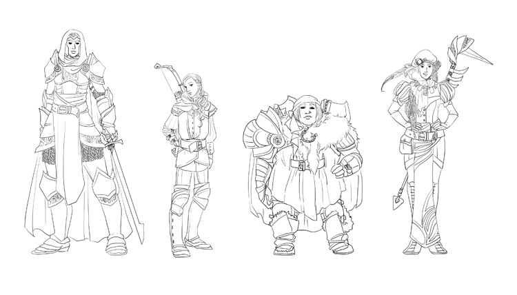
I decided to design fantasy armours on basic shapes. Given that my comic is mainly populated by men (I realised I was operating on the default character = male rule about a year into scripting), I wanted to design female characters. Not only did I want their silhouettes to be vastly different, but I wanted their body shapes, no matter how obscured by armour, to vary. I am working on a couple of game projects with friends and I need to stretch my fantasy designs. More on those projects later! For the visual novel project we are still hammering out the story. I may be posting some concepts later, depending on how much we want to keep under wraps until release! 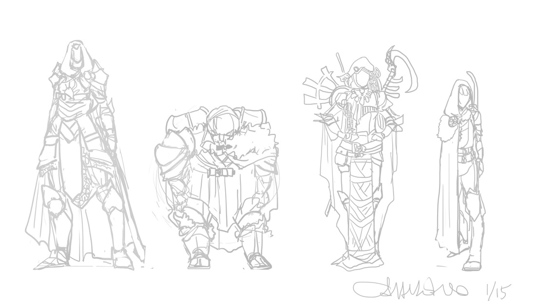 I've been editing for printing my first volume of Spidersilk, as I mentioned in the past post, but there is not much to actually show. It's more of the same -- moving word balloons, continuing art, resizing pages, tweaking dialogue.... But I do want to keep sharing processes here, so I'm going to share my general process for making a character armor design. This character is from Spidersilk. He's a weapons and armor fanatic and I wanted to redesign his armors. Every time I draw him his armor is different, and though he's got quite a collection I doubt it'd be reasonable for someone masquerading as a Carriage Coach to have several sets of fine armor! Let's move onto process. The first thing I do is draw the form. This was the first time I drew a shield, so I drew it right into the form as well as the sword (for balance). 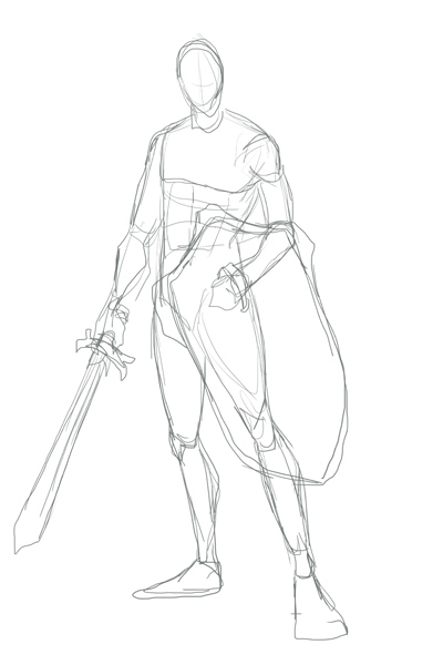 Next, I lower the opacity on the form and build the armors on top of it. Here's an image of that sketch over the form (shown in red here). I tend to not draw helmets. But if I were to send him into battle, then yes, I'd put a helmet on him. Even when playing games I use the "hide helmet" option and my dude in SKYRIM always wears a thief hood. I just like it more, aesthetically. 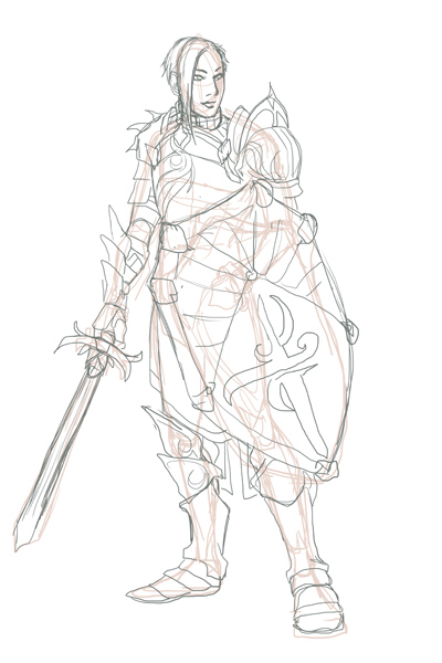 Next I'll show the sketch and the lines. I may change the designs on things at this state. That is simply a placeholder. 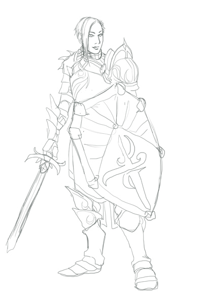 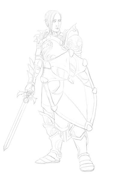 I kind of liked that sketch as is but decided to clean it up ... and make the sword not wobbly. Embellishment makes armor look fancy very easily, even if it's just a simple trim. Check out those swirling patterns! I was playing Dragon Age: Awakening again and when King Alistair marched up I admired the embellishment of his armors and decided to try embellishing armor with that inspiration. Below are the flats and some simple shading, with the final at the end. 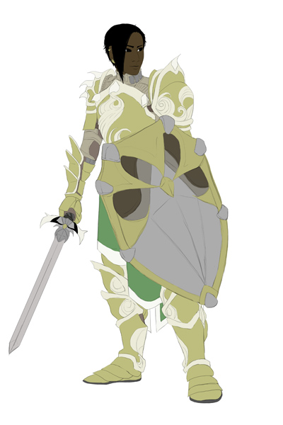 Now, I generally color willy-nilly as I like. I will do flats for, say, the shield then get really excited and render the whole thing before moving on to anything else! But I forced myself, for the sake of this example, to do all the flats first, as you see above. Notice that you can see his arming doublet under the armors at the neck and under the pauldron/spaulders combo and gauntlets; it's why those areas are not gold. 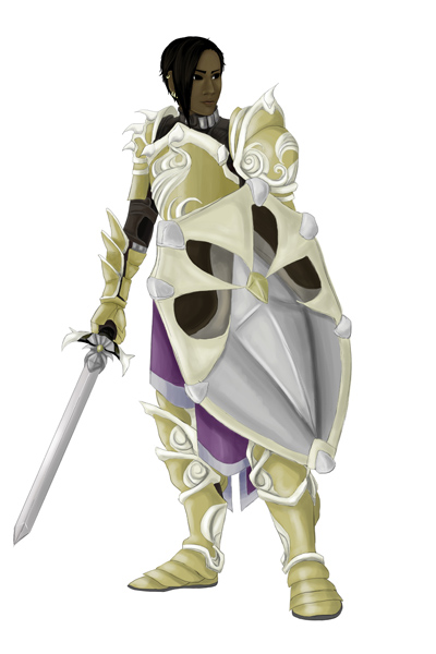 I wanted this to look a bit more warm, so I tried out some textures and effects. I may have said so before, but I use textures from this artist on deviantart. 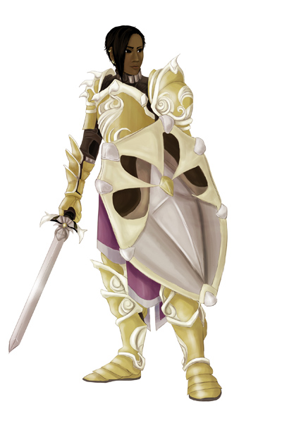 The whole process took about three and a half hours. If you like this, be sure to check out my gallery. If you're into webcomics, read Spidersilk here!
First of all, I needed a good clear image of Fenris' existing armors, and a pretty clear shot of his face. I didn't intend to go into detail but I have found catching 3D characters' likeness in 2D sketches to be a bit of a challenge. These are the reference images I used, both are game screenshots I found in a search online. 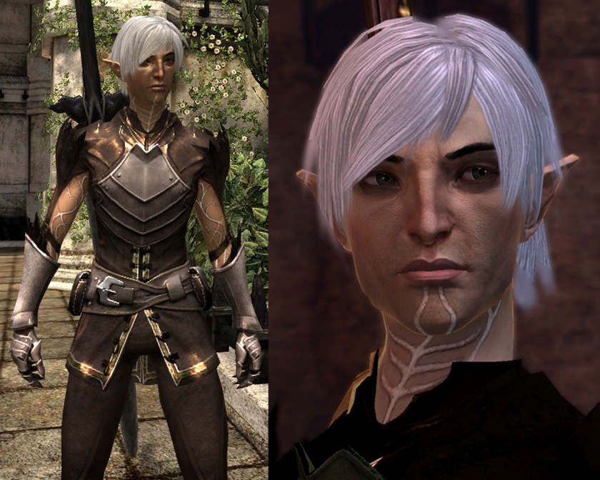 To reiterate, I'm not doing this because I think his armors are terrible. I really love the aesthetic and feeling of Dragon Age and Dragon Age II, and I'm generally not so good at fan art. I probably wouldn't have thought of doing such a project if I hadn't seen someone reimagine a costume for another game character on deviantart! I love drawing armors. That seemed like the sort of fan art I could get into. I thought it'd be a neat challenge. His face was the hardest challenge I think. I really did not want to mess him up. I tried to give myself a pep talk: "No big deal, just draw him like one of your Spidersilk characters ... dang it! Too pretty." I somehow captured his essence. It could be luck. And I drew his head last, momentarily wondering if I could get away with designing armors for him without actually drawing him.... For shame! Anyway, I wondered what armors he might choose. The first one, far left, is based roughly on existing shapes and silhouettes of his outfit. Then they just got clunkier as I went, winding up with massive black armor of doom at the far right. I like that one the best. I'll be collecting opinions on shape, silhouette, details, etc and will use them to bring one of (or a combination of) these armors into a more fully realized painted concept. Done in Photoshop, each one took 35-45 minutes. 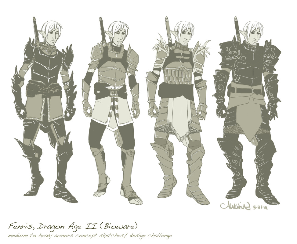 I love drawing armor and have been drawing it extensively for the past two years or so. I would like to try designing armors and weapons for an already set character from a world I have come to know and love very much -- Dragon Age.
I've decided to draw Fenris from Dragon Age II, by Bioware. Fenris is a warrior, but his armors are very minimal. Though I very much like the aesthetics of Dragon Age, I have been wondering what heavy armors on Fenris would look like. What would he choose? I'll want to keep the general aesthetic; as Varric says, it screams "I hate you all! I was a slave!" This should be a fun challenge! Sketches are forthcoming. |
AuthorComic Artist Archives
December 2015
Categories
All
|
 RSS Feed
