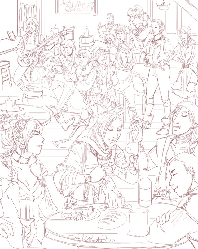
 Working on a crowd scene for my comic Spidersilk. I've been wanting to do one for some time, but the comic takes up most of my illustration time and it is important to put out story content. However ... and yes this does explain my hiatus from the WIP blog ... I got and beat Dragon Age Inquisitions. I was so blown away by story aspects, so wrapped up in it, and so pleased at the little character and world details. A particular cut scene made me really want to do a big tavern scene, so I did this. All kinds of inspiration built up as I played, so when I beat it I let loose with illustrations (though most are of my Inquisitor -- I'll share those later)! When I play great games, watch good movies, etc, it just makes me want to make stories that hit as hard.
After working on that large Dragon Age II fan art, I felt a bit more confident about drawing such a thing. This is the first time I've done an image with so many characters AND a background, and I'm actually looking forward to the long inking process.
0 Comments
Two more chapters to edit! I've begun to wonder if I should bring all elements into the safe zone, or allow for full bleed. Below is the original image, from 2012. While editing I have had to move word balloons, sound effects, and art. It's sometimes quite drastic, and I began thinking about the aesthetic qualities of simply bringing the entire page in, leaving a white margin. I can't be sure what the print margin is, so I can't judge where it will be cut very accurately. I at first did not consider it because it, but when I saw it done for other comics I noticed it looked fine. Several edits ended up like this, so it is worth thinking about making it consistent. (Final printed pages will have the same textured appearance, but will become grayscale to save on print costs.)   I've been editing for printing my first volume of Spidersilk, as I mentioned in the past post, but there is not much to actually show. It's more of the same -- moving word balloons, continuing art, resizing pages, tweaking dialogue.... But I do want to keep sharing processes here, so I'm going to share my general process for making a character armor design. This character is from Spidersilk. He's a weapons and armor fanatic and I wanted to redesign his armors. Every time I draw him his armor is different, and though he's got quite a collection I doubt it'd be reasonable for someone masquerading as a Carriage Coach to have several sets of fine armor! Let's move onto process. The first thing I do is draw the form. This was the first time I drew a shield, so I drew it right into the form as well as the sword (for balance). 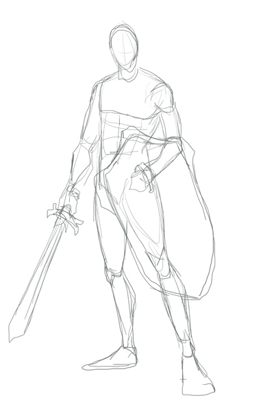 Next, I lower the opacity on the form and build the armors on top of it. Here's an image of that sketch over the form (shown in red here). I tend to not draw helmets. But if I were to send him into battle, then yes, I'd put a helmet on him. Even when playing games I use the "hide helmet" option and my dude in SKYRIM always wears a thief hood. I just like it more, aesthetically. 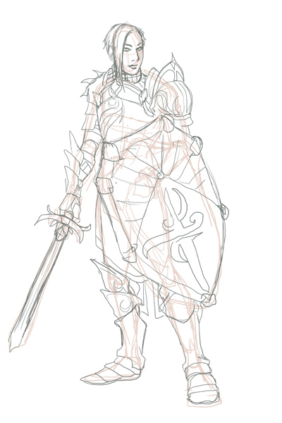 Next I'll show the sketch and the lines. I may change the designs on things at this state. That is simply a placeholder. 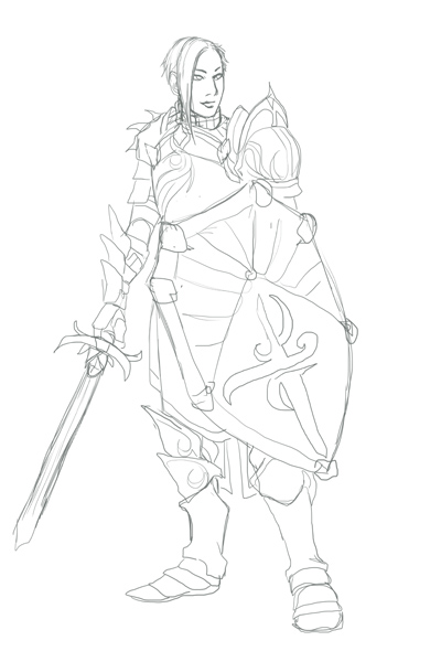 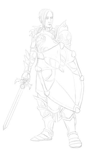 I kind of liked that sketch as is but decided to clean it up ... and make the sword not wobbly. Embellishment makes armor look fancy very easily, even if it's just a simple trim. Check out those swirling patterns! I was playing Dragon Age: Awakening again and when King Alistair marched up I admired the embellishment of his armors and decided to try embellishing armor with that inspiration. Below are the flats and some simple shading, with the final at the end. 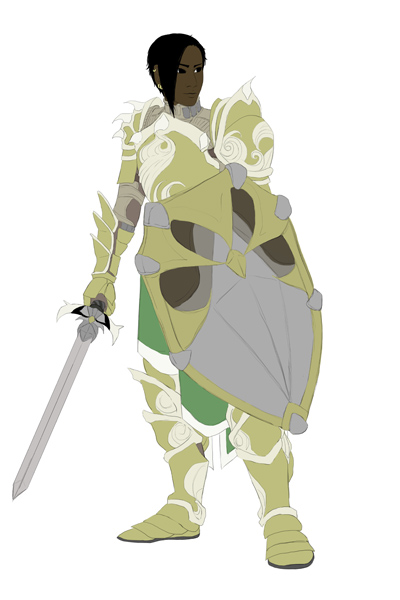 Now, I generally color willy-nilly as I like. I will do flats for, say, the shield then get really excited and render the whole thing before moving on to anything else! But I forced myself, for the sake of this example, to do all the flats first, as you see above. Notice that you can see his arming doublet under the armors at the neck and under the pauldron/spaulders combo and gauntlets; it's why those areas are not gold. 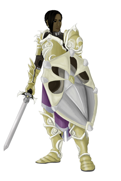 I wanted this to look a bit more warm, so I tried out some textures and effects. I may have said so before, but I use textures from this artist on deviantart. 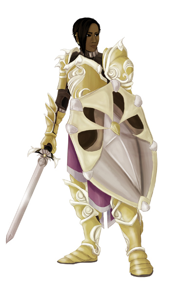 The whole process took about three and a half hours. If you like this, be sure to check out my gallery. If you're into webcomics, read Spidersilk here!
I've finished the set-up steps and am going through the book's layout again. I will from this point forward make sure my comics are easy to edit just in case I have to edit more at some point.... The first two chapters are brutal because of the poor layout, and I have to redraw three pages because of mistakes in saving. To be fair, it was my first foray into digital comics, and I've learned a lot since then. I'm looking forward to scanning and making concept art collages for the special behind-the-scenes chapter! Here's one of those early sketches (about 2010/2011) and some linearts (about 2013).   The Skyrim comic samples will be coming a little later. I've just started the process for getting the first volume of my webcomic, Spidersilk, published as a comic through Inkblazers.com. The process will take a month and a half or two, from start to finished product being available in the store. The option to print is reserved for featured and premium authors, and after I was promoted to featured in February, I began planning for this step. I did consider redoing the first two chapters for some time, and finally asked for the general opinion from fellow artists on the website. Redoing is a case-by-case decision, and I'm not for or against it. For my particular case, the pros were not strong enough against the cons, so I compromised. In any case, it was more important to continue the story at its current pace than to redo something that wasn't entirely broken. Yesterday I laid out the book's proposed content. Chapter six ends at a suitable (though quiet) moment of suspense, so I will end volume one there. It is also roughly 100 pages of content at that point. I am including a chapter of concept/ behind-the-scenes works including early sketches for the characters and for the very popular magic summon, the Ambassador. Some of these early sketches have never been seen by anyone but me. I noticed a lot of creators on inkblazers offer such a thing, and really ... I am very interested in that kind of information about my favorite stories! My next step is to begin working with the provided templates, and make further edits if necessary. I have some experience in editorial design and laid out my first comic for print (in two different sizes) for my final illustration project, and it's something I enjoy doing. Publications were some of the most interesting classes I took in the digital art department, but I'm no expert. If I run into trouble, I will get assistance. I have to edit it anyway to make it print-ready, and as I did this I made minor revisions: adding/removing/changing dialogue, breaking up the word balloons, moving word balloons, adding sound effects, etc. In some cases I redrew a panel or two. Shuffling the panels around was a nice challenge, but it was time-consuming! I wish I'd planned to print from the get-go, rather than assuming it'd always be a webcomic. Too many important elements (art, dialogue) are in the margin. Still, some part of me thought I may print since all pages have a 5x7.5 save at 300dpi. I can be thankful for that preparation at the very least. This is not my first comic, but it is my first purely digital comic. As I went along, my process refined, became quicker, and the later chapters are much easier to edit! After the chapters for the book are edited, I'll go through them all and do a quick test-print of some of the poorly saved pages to determine if they must be redrawn or not. Below you'll see the cover I currently work with. and below that cover, some page edit samples. Click the cover below to be brought to the comic. 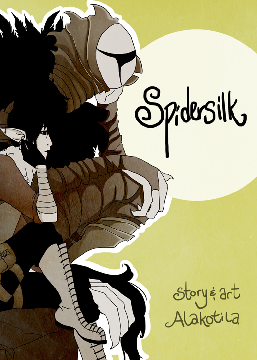  Above, the very first version of page two, chapter one, done in September of 2011. I'm not even sure of the time taken, but every page was painfully slow and required me to edit the linework in illustrator since the tablet was so new to me. Halfway through chapter two I no longer fixed up lines in illustrator, and for the past several chapters the timeframe has been in the three to five hour range (with few exceptions). Below, you can see the minor tweaks I made to this page. Now that I've posted this, I see that Prentice's hair is still shiny and I don't like that! I began doing his hair simply black by chapter three, so I have to change it in earlier chapters. That's what editing is for!  I played with four ideas for the Skyrim fan comic concept, Diary of the Dragonborn's Husband, which revolve around how the NPC Companion Farkus (as a spouse) sees the Dragonborn. They are as follows:
Scrapbook This version would allow me to incorporate collage, with pictures and writing. However, it seemed somewhat unlikely Farkus was taking the time to draw detailed pictures, cutting them out, and pasting them into another book. I mean, he could ... it just didn't fit well enough with the comic approach. Illuminated Manuscript Art History interested me in illuminated manuscripts, and when I saw a storybook approach in the game Valkyria Chronicles I was further inspired. That game is one of the few that inspired me to begin my comic, actually. That storybook approach has been kicking around in my head for two stories, so I'm attached to it. One-shot Comic (Cartoon) This will be the easiest to accomplish, with a scrap of diary in the corner with Farkus' handwriting on whatever daily shenanigans the Dragonborn has gotten himself into. The cartoon will illustrate what really happened, complete with Dragonborn dialogue or thoughts, while the diary will put a kinder spin on it. Diary Page This was most likely but was not very interesting. It is simply a page with sketches. After these considerations I'll likely go with the simple comic approach, but since I'm so drawn to the manuscript idea, I will need to do an ideation in both styles and get feedback. The comic would be a straight-forward approach with the action happening and a simple paragraph of what Farkus would write (or has written) about the event. The manuscript would be his actual diary page and, I would assume, his illustrations. Farkus is a weird character. His stats are crazy. He trains in heavy armor, but has low skill in it. Despite being a Companion, his sneak is really high. I figured such a contradictory character would be a bit weird, and that it's likely he's got some strange talents hidden away, like illustrating his diary full out illuminated manuscript style. A friend of mine does comics related to games she's playing when she's not hard at work with her original comic series. I've always wanted to do such a thing, make a few comics about games since I enjoy reading them. I never had a very good idea, and fan art can be quite taxing. Now that I'm doing a consistent original fantasy series, it wasn't a smart idea to take much time from it. However ... I was talking with that friend about something that'd happened in my recent playthrough of SKYRIM -- so first, a story. I have the Hearthfire DLC, and immediately built a house and adopted two children, one of whom immediately adopted a nasty, loud skeever. The thing grossed me out and I read somewhere that the kids wouldn't care if you got rid of it, even if you killed it right in front of them. I finally worked up the guts to do so, hid in my alchemy tower, pulled out my bow, and took aim. Please note my stealth is always insanely high. Bullseye! But ... the kid fired out of the chair, yelled that he hated me, and ran away. My other child did the same when I approached her. They both ran away yelling curses. I was distraught -- "I was told they wouldn't care!!" In any case, I left the house and came back hoping it would clear up in time. By default, one of the children ran up to me and asked me to play tag. So I said yes, relieved they were over the skeever thing. As I ran after one of them they shouted, "Go away I hate you!!" It was so pathetic I just restarted and have to deal with the skeever even now. My friend and I began imagining this and other happenings through the Dragonborn husband's eyes. My Dragonborn married Farkus, from the Companions. You know, being married to the Dragonborn may not always be as exciting as you would think, especially when he may not be all that epic.... And let's be honest about the hilarity of SKYRIM glitches. The armor dummy walks around the top floor of my house every time the Dragonborn comes in through the 2nd floor door. Does that hurt gameplay? No. Is it scary? Quite. Did I put goofy mismatched clothes on the armor dummy to teach it a lesson? Maybe. And thus "Diary of the Dragonborn's Husband" was concocted. I've been thinking about it for some time and have revisited the idea, so I think I've got something worth attending to! The initial sketches were simple, with a line or two from Farkus' diary concerning some event that'd happened, with intentional misunderstandings of the Dragonborn's reactions (since he's supposed to be heroic). I want to change it from that somewhat, though I do want it to be in a diary format. My first task will be to come up with a basic layout for each entry, or page. I'll post those ideas later, but for now, here are some WIPs from the initial idea. Immediately below are some notes on the Dragonborn's appearance, and at bottom is a sketch of a diary entry. 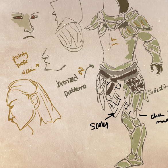 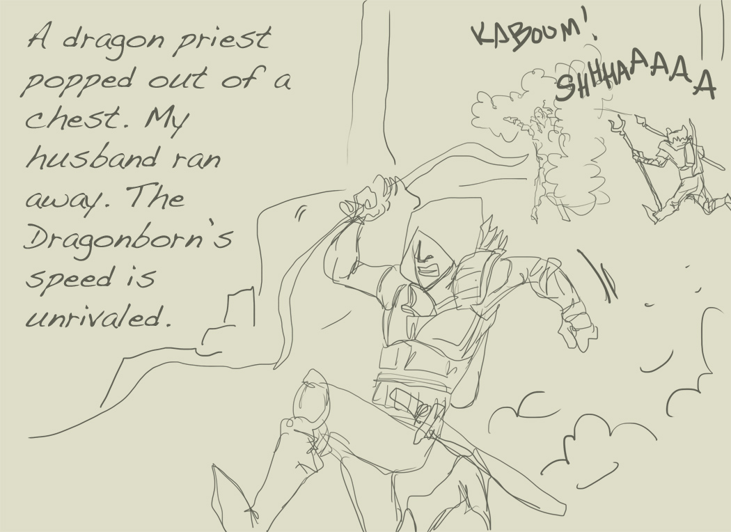 The character contest mentioned in the previous blog entry will end on the 20th. I'll release the sketches then. Today I'll share the basic process of one of my comic pages. I've been doing webcomics for ten years, though I hit a rough patch of updating while I was in university. However, Spidersilk will celebrate its three year anniversary in September and has been going strong. It was promoted to "featured" on inkblazers.com in February. Each Spidersilk comic page takes about three and a half to four hours. A very detailed page can take up to five. Since I tend to do scripting and storyboarding altogether before drawing, it is hard to determine the exact amount of time in each page. The bulk of the comic is monochrome, but first page of each chapter is in color to help readers visualize the world. It is the page that sets many of the colors for the rest of the chapter, and this page is usually more detailed to help set the scene. I had to draw horses and a city scene for this page. I have drawn only one horse in the past four years and have little experience with city scenes. I've been doing horse sketches to prepare for this chapter, but for the most part I didn't line or color them. I just needed proportions and to get comfortable. (I am not comfortable with them, but I suspect by the end of this chapter I will be!) Though each step for this page took longer than usual, this is a fairly normal process. After the script I storyboard - lay it all out. I add the dialogue in this step, then hide it. Depending on comfort level, I do two to three sketch layers before inking (digitally). After that comes inking. I then add black, and position and fill in the word balloons. From there I add the colors, but since my lines for this comic are not tight I don't use the magic wand bucket-fill option. The coloring process can be time-consuming, especially for the first page. Below is a slideshow of the image coming from the storyboard/roughs stage to completion. This is the opening page of chapter eleven. Because I was consulting images of horses and cityscapes often, this page took a few hours longer than usual. As I go through the chapter I will become more comfortable drawing the city and horses. Below I'll share a sketch compilation of horses (in general) I did around the beginning of the year in anticipation of this chapter. Last, there is a compilation of reference images I used for this page. I generally don't need reference images for most pages (other than ones I made of characters to be certain of facial features/profile/details are correct), but I ended up using quite a few. 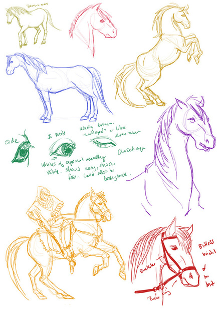 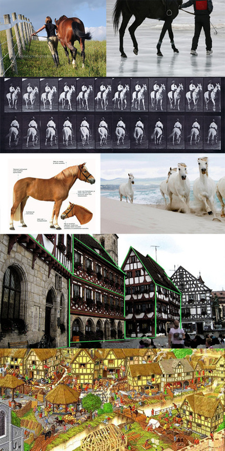 In the city scene second from bottom I used green lines to highlight the angles. I have been looking at tutorials on perspective and making cities look organic. Being able to see how this was at work in such a picture helped me draw the basic idea.
I decided to take part in a tournament-styled competition on Inkblazers.com. For this competition, everyone who entered was paired off with another comic artist. We read each other's work and design a character to fit within their universe. Judging criteria is based on art quality, design, and description (how well the character fits).
Winners from each bracket will proceed to the next and face a new competitor. I did something like this on Inkblazers several months ago, where competitors entered characters and each artist drew his/her own character with their opponent's character. I enjoyed it, and have been looking for another competition to do on inkblazers. It's a great way to get familiar with another artist's work, get feedback from talented artists, and to have more exposure for your own work. I will be posting sketches after reading the comic I have been assigned. By luck I already know of it, but it's quite detailed, so I want to be sure to create a plausible character. I will be designing a character for FixerTheWise with his webcomic, "Shapeshifter: A tale yet untold." |
AuthorComic Artist Archives
December 2015
Categories
All
|
 RSS Feed
