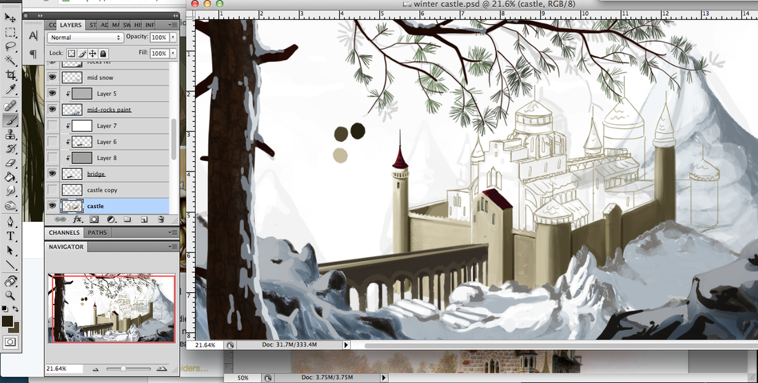
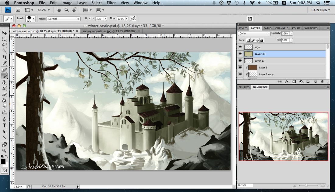
  Five hours in on my current environment concept art. First time painting snow ... or maybe the second, but these things have certainly gotten better over the past year! I took out the bridge. It was kind of terrible and I could not get it to work, nor did I want it to take away from the castle itself.
This is done in the way I learned game concept art, but I am doing this for an area that will show up later in my comic. I figured it was a good idea to do pieces for the different cities or areas!
0 Comments
About halfway through another concept. I decided to tackle another season to do something different since I seem to always want to draw water. This time I am using more painting and shading rather than texture-borrowing as a trial. Here it is about three hours in. There are placeholder textures in parts of the image. The background sky is from the clouds trial I painted last week! I will need to go back in and detail the front (especially) and finish up the back cliffs. I will probably do some more textures and paints on the rocks as well. I won't know until I get there if something is asking to be completed…. There is a scene in the book I have written at a river, and I guess I imagined this, but there is not a waterfall in sight at the particular incident though the character can hear it. Perhaps this is a way up the stream, where there is a little waterfall! 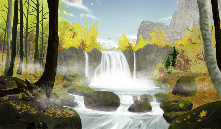 It's been a couple of months since posting, but I ended up doing a lot of commission work that I was unable to share. I'm making it a point to do extra work for sharing recently, and have found it makes me even more productive! I am going to share some of the fashion sketches I began doing after checking out "Fashion. The Definitive History of Costume and Style." While looking through it I began doing sketches on armours, dresses, even hats. The hats are my favourite, so I will share those. These may become something more, but for now, I like them as is. 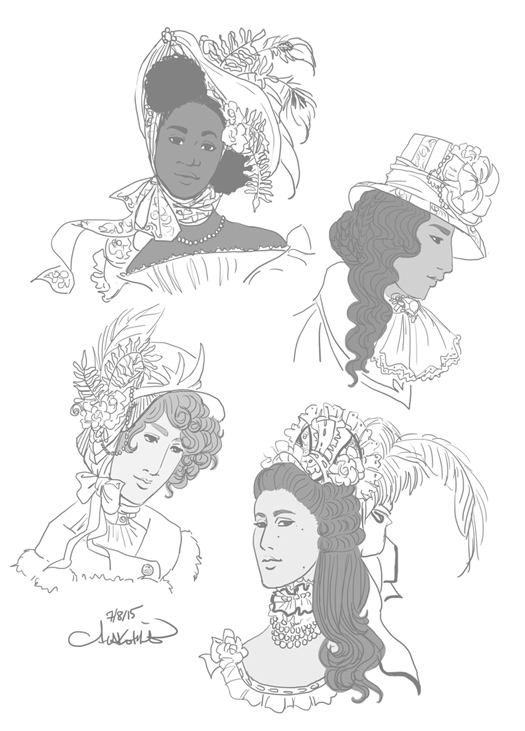 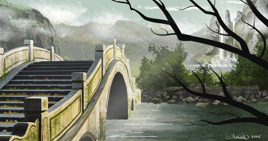 This is my second finished concept. The first I did not finish because it did not look right, and as I was using skills picked up from a tutorial, I had a somewhat realistic idea of where it should be even at that stage. I realised my mistake was using the soft round brush; all shapes seemed murky and vague. I used the hard brush for the second try (the desert scene below) and used the same tips and advice to push forward for this piece. Next on the practice list is more architecture, possibly a castle or ruins. Here are my reference images, used for textures etc, and in the case of the bridge, basic shapes. I do not have many environment arts yet, so there is no folder in my portfolio … yet. But I am working on that! 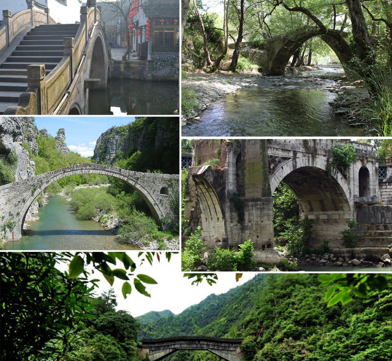 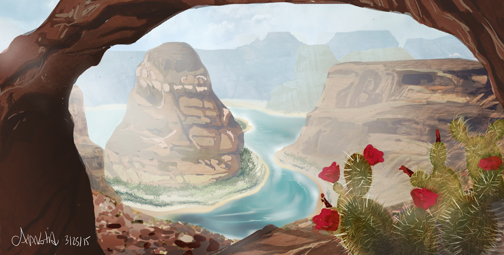 Here is my first environment concept art for games -- well, finished anyway! The very first I abandoned because it was not coming together. I went back to the tutorial so I could understand where I had gone wrong (and I did find out) and took the tips and skills to a new concept, which is what you see here. While I do like this, I don't think it is quite good enough for my portfolio. I have been working on others since and will soon add an 'environment' section to my concept art portfolio here!
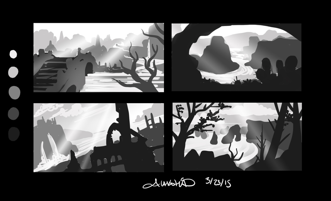 My new tablet arrived in the mail today. It is much larger than the one I have been using for the past five years, so I immediately tested it out with some more environment concept thumbnails! These are a lot blockier than my first round and I don't think I really warmed up until the third, the ruins on the coast, but that is what ideations are for.
My older computer has lost about a fifth of its screen so I worked zoomed in. I did not zoom in for these, and I think that explains the lack of detail (in comparison to round 1, below). My newer computer will be able to handle the layers needed to create more detailed work, and I am looking forward to bringing one of these thumbnails to completion. I have been using tutorials (tutsplus.com) to help sharpen some of my skills, expand on them, and even learn some valuable support skills (website building). I decided to expand my concept art by adding environment to the mix. I enjoy being in nature, and have for years wished I was even remotely good at drawing what was in my head. I began trying to use resources and references, but even in the past few years I made little progress and honestly didn't spend much time on it as I wasn't using it much in my comic. I tend to pick up pieces of information along the way and something will snap them all together. Sometimes, someone presents something in a way that just makes so much sense…. This tutorial on environment concept art for games put all the puzzle pieces together! I was so giddy, sitting there at my computer, making these thumbnails. It's exciting when things just click! I will need to have a lot more practice with it, since digital painting in this way is still not my strongest skill. But that's what the digital paint tutorials are for! I will be adding an environment art category into my concept art folder, but for now, here are some of my early thumbnails. 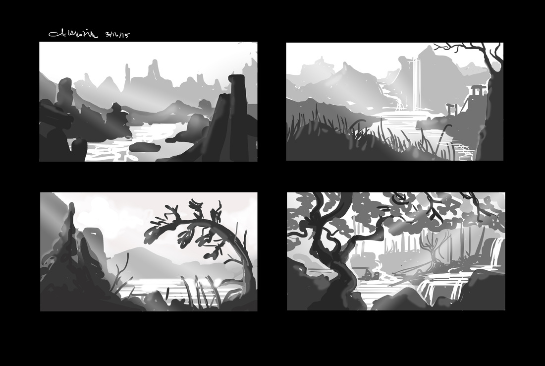 I decided to design fantasy armours on basic shapes. Given that my comic is mainly populated by men (I realised I was operating on the default character = male rule about a year into scripting), I wanted to design female characters. Not only did I want their silhouettes to be vastly different, but I wanted their body shapes, no matter how obscured by armour, to vary. I am working on a couple of game projects with friends and I need to stretch my fantasy designs. More on those projects later! For the visual novel project we are still hammering out the story. I may be posting some concepts later, depending on how much we want to keep under wraps until release! 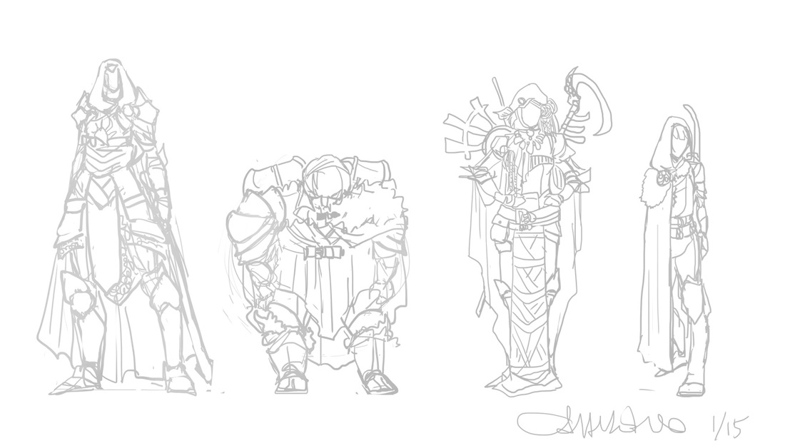 Below are the mage hats from Round 1. To refresh your memory, this is a challenge I decided on since it seems so many Dragon Age fans are unhappy with the mage hats. I have a sneaking suspicion the artists just decided to run with goofy mage hats at some point, since the ones in upcoming Inquisition are just fabulously over the top (from what I can tell). Although the hood seems to be the favored mage gear, I initially went with magic and ritualism as it has existed throughout history -- the idea that certain plants, animals, or even colors hold properties or symbolize protection, strength, etc. Here are the hats from Round 1. 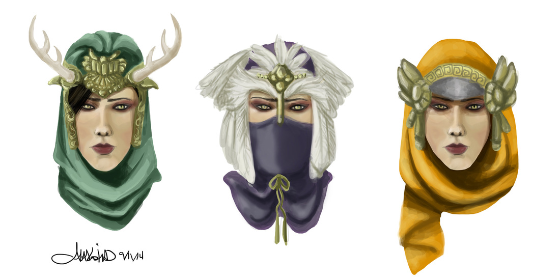 I asked friends, many of them artists and designers, and fans of games, to vote and comment on the hats. Non-gamers tended to favor the aesthetics of the green hat with the horns, while gamers (who already had a bias towards what mage hats "should" look like) preferred instead the purple and orange hats, often citing that they looked more like the traditional mage hat (though they did seem to like mage hat 1 a lot as well). I took the feathers from hat 2, the excess of gold adornment from all three, and the general shape of the twin gold pieces in hat 3. These were the favored elements of each hat. There are mini horns on the green hat below to honor hat 1 from round 1 since so many people had liked them (myself included)! I created three new hats, which will undergo more voting and commentary. Each hat below took 15 - 20 minutes to design and create. Personally I think these are a lot stronger, and I imagine they'll get better. I will do at least one more round after the voting. 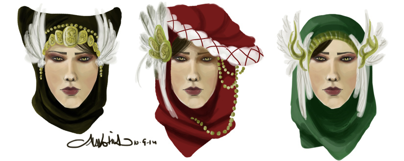 The Mage Hat challenge model is Morrigan, of the Dragon Age games.
It just occurred to me that I ought to make a male face to pop into the hats to see if it is as successful as some of these ideations. Next time I update on the Mage Hat design challenge, we'll see that as well! |
AuthorComic Artist Archives
December 2015
Categories
All
|
 RSS Feed
