|
I discussed a potential fan comic mini series based in SKYRIM (by Bethesda) earlier this month in this blog. I have a few other projects on at the moment, so I had to set it aside for a couple of weeks. It's back! After considering the illuminated manuscript look vs. comic look, I went with comic. When I reviewed my comic script, I realized it would need to have at least three panels and that I wouldn't get away with a one-shot too easily for this project. At this moment, there will be around two dozen of these comics. Here is the template I'm working with right now. The diary boxes (with jagged edges) will be what Farkus has written. These boxes can be of any size, and can be drawn in new places depending on balance. The comic panels will show reality, or what has really happened. Usually Farkus' view will be very forgiving of this very unepic Dragonborn. 40 minutes, Photoshop (includes time of initial concept/ layout) 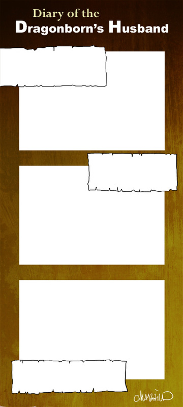
0 Comments
I've been editing for printing my first volume of Spidersilk, as I mentioned in the past post, but there is not much to actually show. It's more of the same -- moving word balloons, continuing art, resizing pages, tweaking dialogue.... But I do want to keep sharing processes here, so I'm going to share my general process for making a character armor design. This character is from Spidersilk. He's a weapons and armor fanatic and I wanted to redesign his armors. Every time I draw him his armor is different, and though he's got quite a collection I doubt it'd be reasonable for someone masquerading as a Carriage Coach to have several sets of fine armor! Let's move onto process. The first thing I do is draw the form. This was the first time I drew a shield, so I drew it right into the form as well as the sword (for balance). 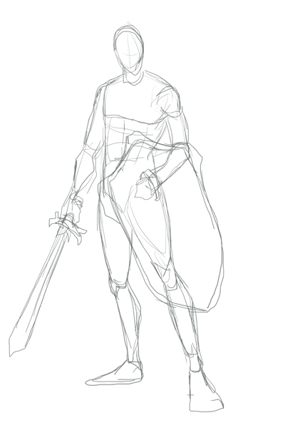 Next, I lower the opacity on the form and build the armors on top of it. Here's an image of that sketch over the form (shown in red here). I tend to not draw helmets. But if I were to send him into battle, then yes, I'd put a helmet on him. Even when playing games I use the "hide helmet" option and my dude in SKYRIM always wears a thief hood. I just like it more, aesthetically. 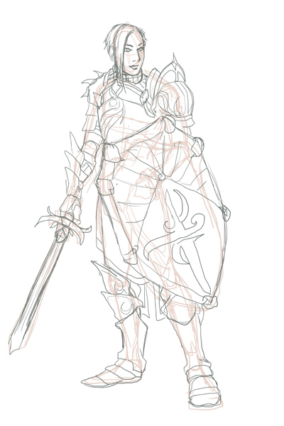 Next I'll show the sketch and the lines. I may change the designs on things at this state. That is simply a placeholder. 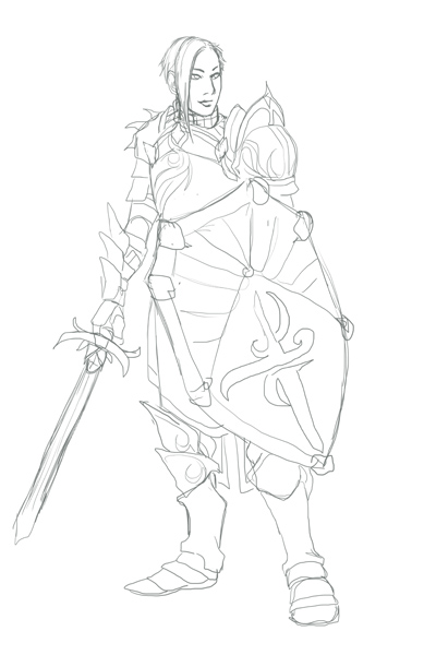 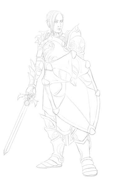 I kind of liked that sketch as is but decided to clean it up ... and make the sword not wobbly. Embellishment makes armor look fancy very easily, even if it's just a simple trim. Check out those swirling patterns! I was playing Dragon Age: Awakening again and when King Alistair marched up I admired the embellishment of his armors and decided to try embellishing armor with that inspiration. Below are the flats and some simple shading, with the final at the end. 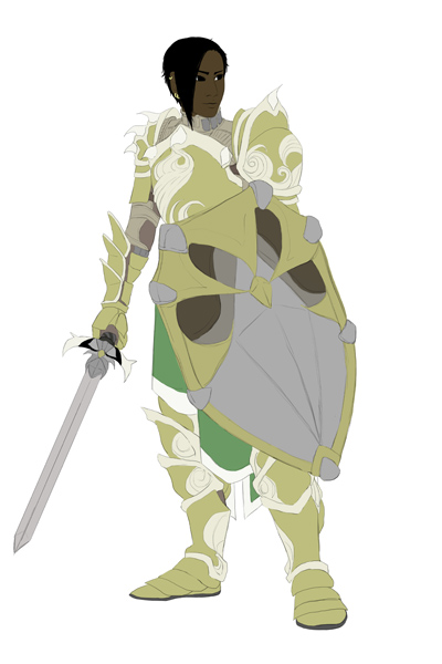 Now, I generally color willy-nilly as I like. I will do flats for, say, the shield then get really excited and render the whole thing before moving on to anything else! But I forced myself, for the sake of this example, to do all the flats first, as you see above. Notice that you can see his arming doublet under the armors at the neck and under the pauldron/spaulders combo and gauntlets; it's why those areas are not gold. 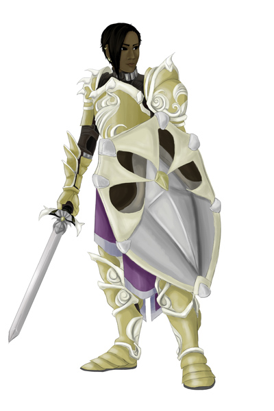 I wanted this to look a bit more warm, so I tried out some textures and effects. I may have said so before, but I use textures from this artist on deviantart. 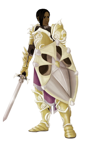 The whole process took about three and a half hours. If you like this, be sure to check out my gallery. If you're into webcomics, read Spidersilk here!
I've finished the set-up steps and am going through the book's layout again. I will from this point forward make sure my comics are easy to edit just in case I have to edit more at some point.... The first two chapters are brutal because of the poor layout, and I have to redraw three pages because of mistakes in saving. To be fair, it was my first foray into digital comics, and I've learned a lot since then. I'm looking forward to scanning and making concept art collages for the special behind-the-scenes chapter! Here's one of those early sketches (about 2010/2011) and some linearts (about 2013). 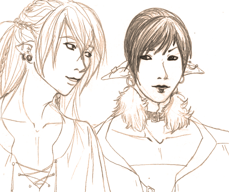 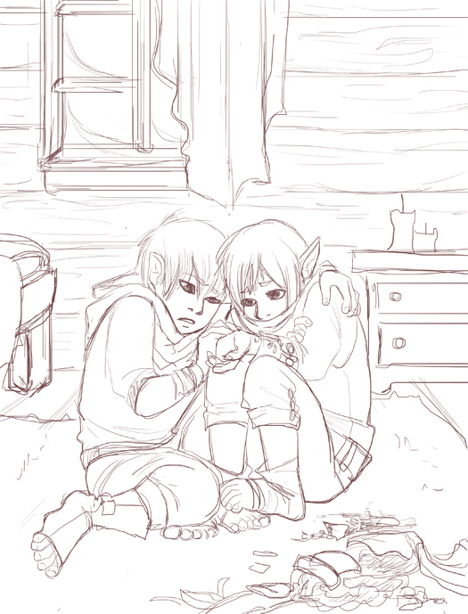 The Skyrim comic samples will be coming a little later. I've just started the process for getting the first volume of my webcomic, Spidersilk, published as a comic through Inkblazers.com. The process will take a month and a half or two, from start to finished product being available in the store. The option to print is reserved for featured and premium authors, and after I was promoted to featured in February, I began planning for this step. I did consider redoing the first two chapters for some time, and finally asked for the general opinion from fellow artists on the website. Redoing is a case-by-case decision, and I'm not for or against it. For my particular case, the pros were not strong enough against the cons, so I compromised. In any case, it was more important to continue the story at its current pace than to redo something that wasn't entirely broken. Yesterday I laid out the book's proposed content. Chapter six ends at a suitable (though quiet) moment of suspense, so I will end volume one there. It is also roughly 100 pages of content at that point. I am including a chapter of concept/ behind-the-scenes works including early sketches for the characters and for the very popular magic summon, the Ambassador. Some of these early sketches have never been seen by anyone but me. I noticed a lot of creators on inkblazers offer such a thing, and really ... I am very interested in that kind of information about my favorite stories! My next step is to begin working with the provided templates, and make further edits if necessary. I have some experience in editorial design and laid out my first comic for print (in two different sizes) for my final illustration project, and it's something I enjoy doing. Publications were some of the most interesting classes I took in the digital art department, but I'm no expert. If I run into trouble, I will get assistance. I have to edit it anyway to make it print-ready, and as I did this I made minor revisions: adding/removing/changing dialogue, breaking up the word balloons, moving word balloons, adding sound effects, etc. In some cases I redrew a panel or two. Shuffling the panels around was a nice challenge, but it was time-consuming! I wish I'd planned to print from the get-go, rather than assuming it'd always be a webcomic. Too many important elements (art, dialogue) are in the margin. Still, some part of me thought I may print since all pages have a 5x7.5 save at 300dpi. I can be thankful for that preparation at the very least. This is not my first comic, but it is my first purely digital comic. As I went along, my process refined, became quicker, and the later chapters are much easier to edit! After the chapters for the book are edited, I'll go through them all and do a quick test-print of some of the poorly saved pages to determine if they must be redrawn or not. Below you'll see the cover I currently work with. and below that cover, some page edit samples. Click the cover below to be brought to the comic. 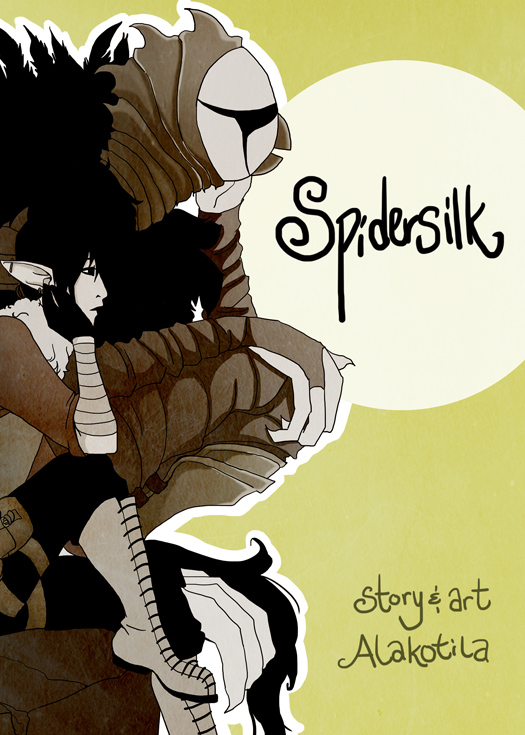 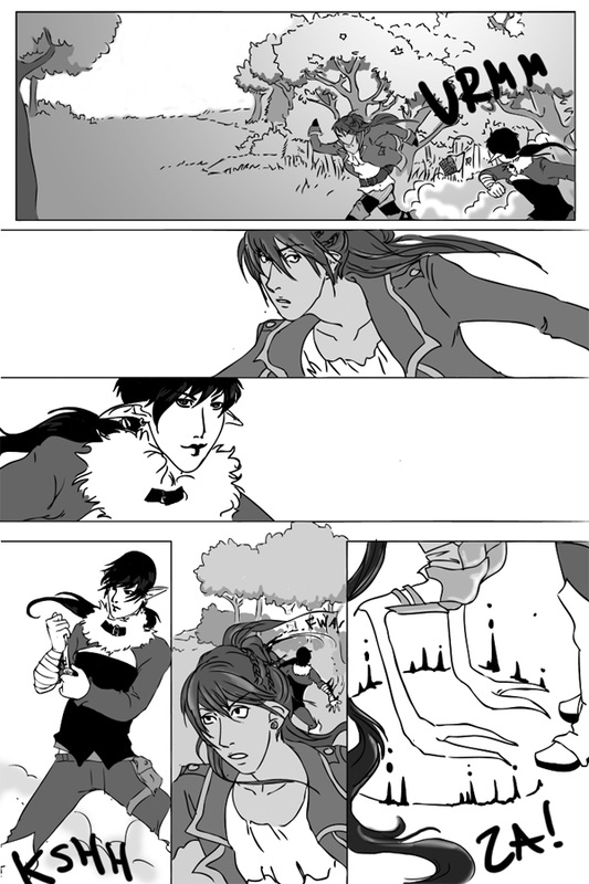 Above, the very first version of page two, chapter one, done in September of 2011. I'm not even sure of the time taken, but every page was painfully slow and required me to edit the linework in illustrator since the tablet was so new to me. Halfway through chapter two I no longer fixed up lines in illustrator, and for the past several chapters the timeframe has been in the three to five hour range (with few exceptions). Below, you can see the minor tweaks I made to this page. Now that I've posted this, I see that Prentice's hair is still shiny and I don't like that! I began doing his hair simply black by chapter three, so I have to change it in earlier chapters. That's what editing is for! 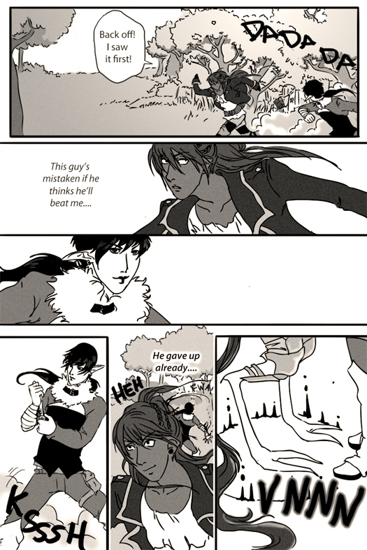 I played with four ideas for the Skyrim fan comic concept, Diary of the Dragonborn's Husband, which revolve around how the NPC Companion Farkus (as a spouse) sees the Dragonborn. They are as follows:
Scrapbook This version would allow me to incorporate collage, with pictures and writing. However, it seemed somewhat unlikely Farkus was taking the time to draw detailed pictures, cutting them out, and pasting them into another book. I mean, he could ... it just didn't fit well enough with the comic approach. Illuminated Manuscript Art History interested me in illuminated manuscripts, and when I saw a storybook approach in the game Valkyria Chronicles I was further inspired. That game is one of the few that inspired me to begin my comic, actually. That storybook approach has been kicking around in my head for two stories, so I'm attached to it. One-shot Comic (Cartoon) This will be the easiest to accomplish, with a scrap of diary in the corner with Farkus' handwriting on whatever daily shenanigans the Dragonborn has gotten himself into. The cartoon will illustrate what really happened, complete with Dragonborn dialogue or thoughts, while the diary will put a kinder spin on it. Diary Page This was most likely but was not very interesting. It is simply a page with sketches. After these considerations I'll likely go with the simple comic approach, but since I'm so drawn to the manuscript idea, I will need to do an ideation in both styles and get feedback. The comic would be a straight-forward approach with the action happening and a simple paragraph of what Farkus would write (or has written) about the event. The manuscript would be his actual diary page and, I would assume, his illustrations. Farkus is a weird character. His stats are crazy. He trains in heavy armor, but has low skill in it. Despite being a Companion, his sneak is really high. I figured such a contradictory character would be a bit weird, and that it's likely he's got some strange talents hidden away, like illustrating his diary full out illuminated manuscript style. |
AuthorComic Artist Archives
December 2015
Categories
All
|
 RSS Feed
