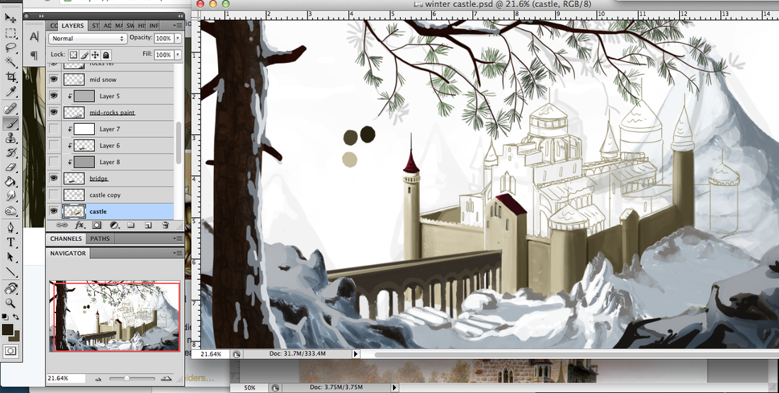
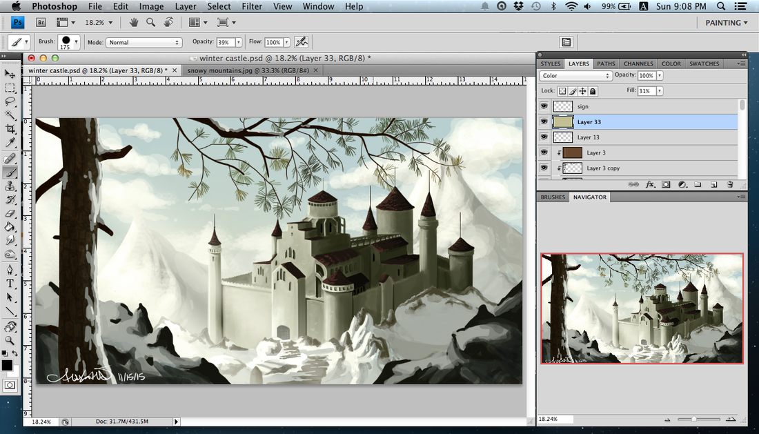
  Five hours in on my current environment concept art. First time painting snow ... or maybe the second, but these things have certainly gotten better over the past year! I took out the bridge. It was kind of terrible and I could not get it to work, nor did I want it to take away from the castle itself.
This is done in the way I learned game concept art, but I am doing this for an area that will show up later in my comic. I figured it was a good idea to do pieces for the different cities or areas!
0 Comments
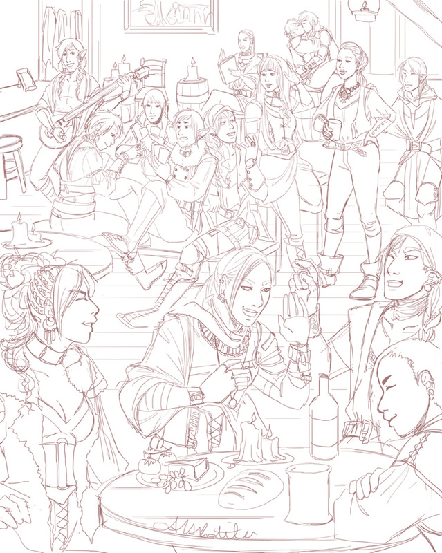 Working on a crowd scene for my comic Spidersilk. I've been wanting to do one for some time, but the comic takes up most of my illustration time and it is important to put out story content. However ... and yes this does explain my hiatus from the WIP blog ... I got and beat Dragon Age Inquisitions. I was so blown away by story aspects, so wrapped up in it, and so pleased at the little character and world details. A particular cut scene made me really want to do a big tavern scene, so I did this. All kinds of inspiration built up as I played, so when I beat it I let loose with illustrations (though most are of my Inquisitor -- I'll share those later)! When I play great games, watch good movies, etc, it just makes me want to make stories that hit as hard.
After working on that large Dragon Age II fan art, I felt a bit more confident about drawing such a thing. This is the first time I've done an image with so many characters AND a background, and I'm actually looking forward to the long inking process. On September 26th, my comic turned three years old. It was launched in 2011 on that date, though under a different name. The first half year for Spidersilk was tumultuous due to the steep learning curve of using a tablet (as well as other issues). I renamed it and doubled efforts on updating after half a year. I threw myself into networking and advertising as well. It built slowly, and after it became featured on Inkblazers.com things have been gliding along. It picks up on average 30 new readers a month and ranks in the top half of all featured comics on inkblazers quite consistently. The comic must come first, above other projects (as fun as they are!) and I have been spending much time on it. For the third anniversary I initially thought I could get the copy ready for print, and that is still in the works, but I haven't completed the necessary work for that yet. So ... I decided to do a promotional event, for whatever I can manage at my moment. I am reading "Console Wars" and it makes me want to aggressively market something, anything -- good thing I have a comic! It made me think for quite some time on what I could do with what I had, and what was going to be the most beneficial for the comic. So, I basically asked fans to share the comic, and add why they liked it. Simple, takes little time, is fairly easy for me to track entries, and will give me a really good idea from otherwise silent fans what it is about Spidersilk that is interesting, unique, and catches attention to better help me promote it in the future. (Tumblr post details) A week ago I began drawing this to put up as a thank you to readers. Clothes-swapping is always good, though I don't know what the heck Prentice (far right) is doing. He is either not a very good fashion model or an exceptional one. I can't really tell! 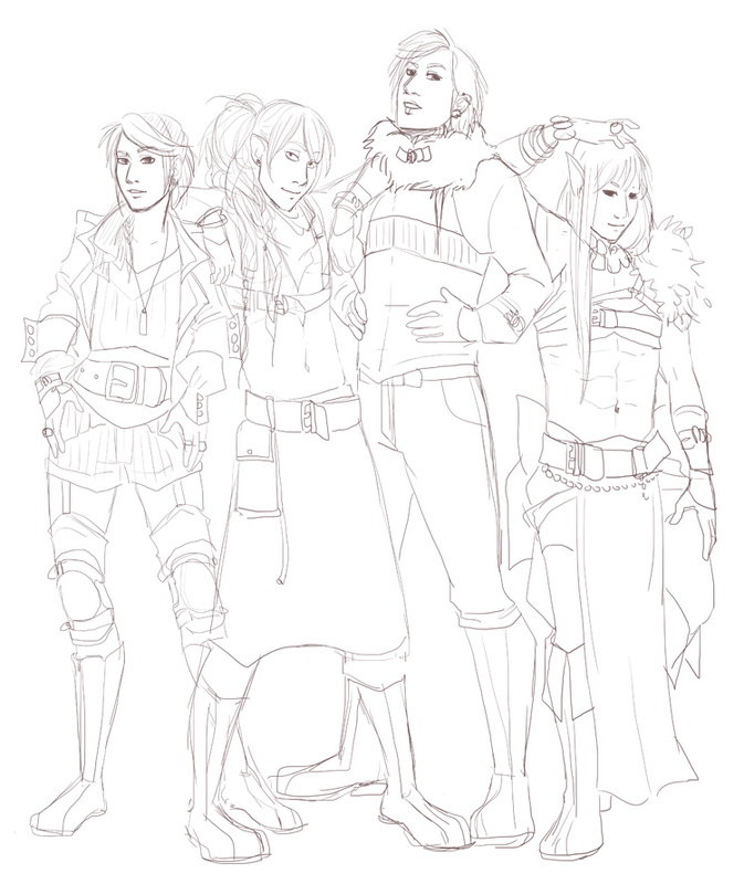 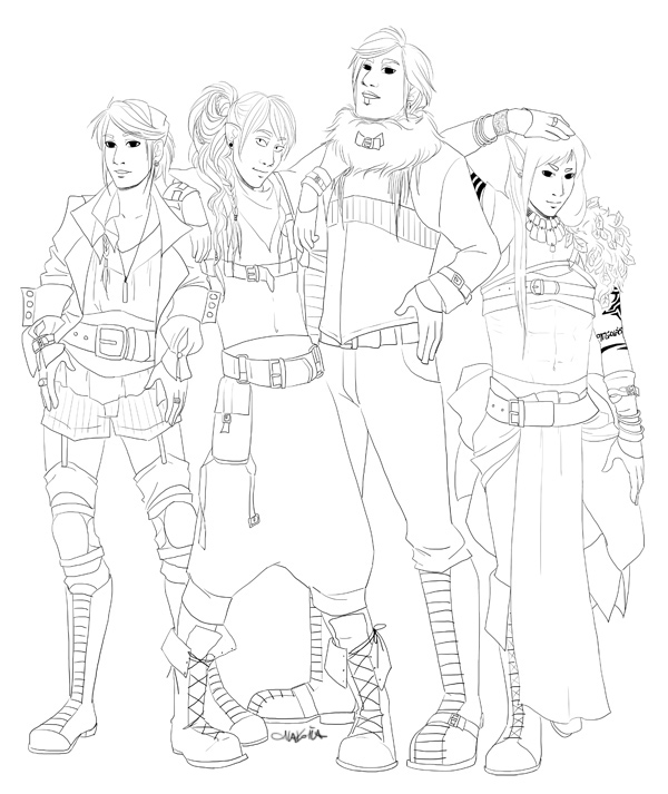 Now that all the moving from country to country thing is settled, I've had time to get back into a schedule. Spidersilk is updating three times a week and commissions have opened! Below is a commission for six costumes for a D&D character by northernvehemence. The character is a bard who raps, and the world is a bit steampunk. I was pretty excited by this one! Very fun to do. 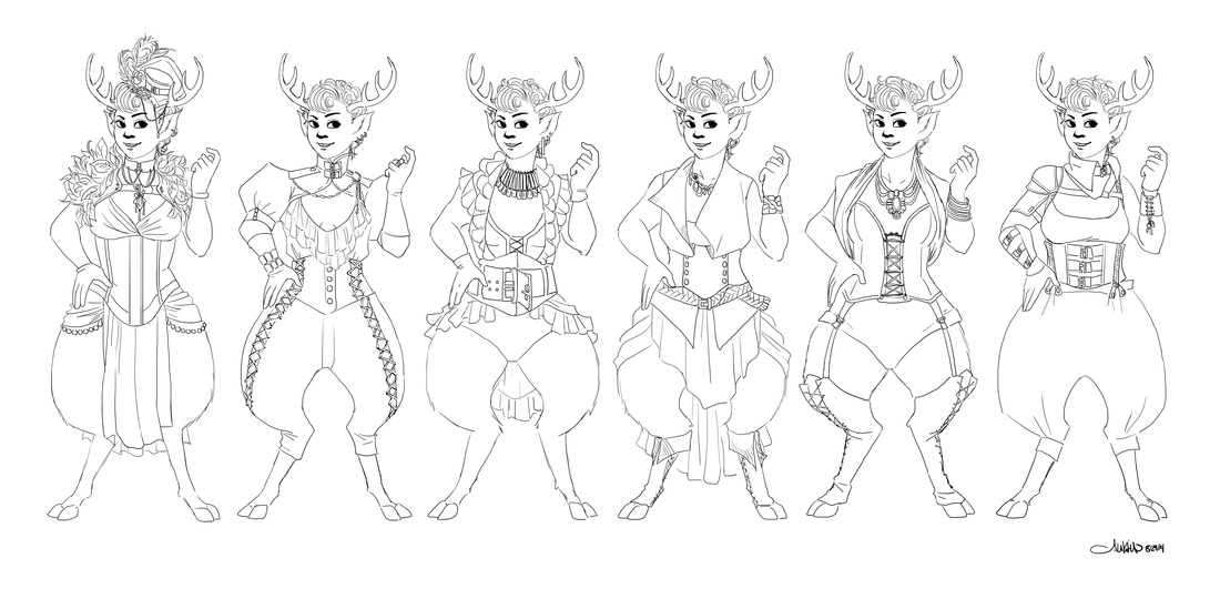 I've also been able to do a fair amount of personal illustrations. My recent one is a romantic fantasy image. I really wanted to do this one because I don't find the pose all that romantic yet I have seen it in a lot of places! I have this thing about drawing cliche poses -- in fantasy, pin-ups, whatever. Otherwise my "couple" illustrations are a bit weird, and they are always doing something like reading or eating for some reason. Anyway, here's the sketch. The final version will appear in the illustration section of my portfolio. 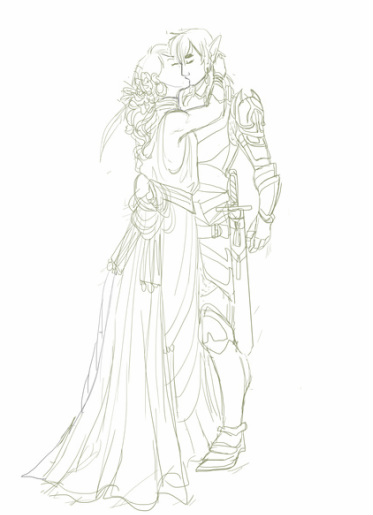 WIP Since this image was fairly successful (even with this pose!) with its flat coloring and dusty palette, I might try out something similar for the elusive Dragon Age fan art I keep trying to do. My Dragon Age II is somewhere over the ocean on a boat being shipped from Japan to home, but I could always make up a new Hawke. I have about six of them anyway!
Here are some ideations for Prentice’s sacrifice dagger, as mentioned in the previous post. In Spidersilk, mages who cannot harness the full natural energy of magic and only the basic primal energy of blood are called “syphons.” There are all sorts of rules and limitations to syphon magic, but that’s not the point here. Prentice is such a mage, and he usually uses his own blood. It is why he carries a small knife or dagger. At first I decided to try a new sort of dagger than the one he usually has in the comic. His last dagger looked more like some kind of combat knife. He will use the dagger as a weapon but he prefers to use it only for magic, which is why he’s usually otherwise armed. 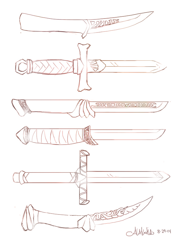
Since it has such a specialized use, I decided it’d probably be ornamental, maybe pricey, and likely have spellwork or runes engraved right into it. He always has it and it clearly means a lot to him, though why hasn’t been revealed yet. I thought I should play up making it as distinctive as possible.
He’s got his summoning down to an exact art, able to form a summoning portal with two gestures, throwing blood from his arm and the knife. The knife should have some capabilities of holding onto his blood to facilitate a fairly even distribution when he does this – that’s when I started ornamenting the blade with small indentations rather than what could be ornamental spell support. You can see that on the last blade. I don’t like any of these blades as is for Prentice’s purposes, but I can see some of them getting reworked for the final design. I have completed my move and am settling in. I will begin the WIP blog once more! My current running side-projects include more Dragon Age fan art, a fan comic about SKYRIM, as well as various commissions. In order to flesh out my portfolio, I do think it's important now to spend more time documenting processes on drawing props, environments, and architecture. To that end, I am going to draw a new staff for Prentice (of my comic Spidersilk), since it tends to be different whenever I draw him with one! This is his latest, but I will be looking at all of his staff images for ideas, as well as generating quite a few new ones! 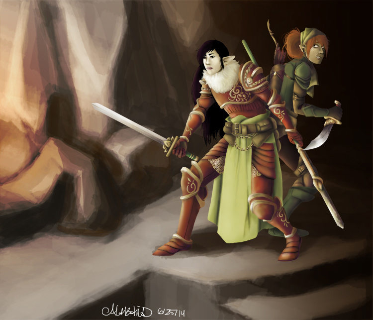 I love designing characters and have made many over my decade of making webcomics. I have put a lot of effort into my world-building of Spidersilk. It occurred to me some months ago that though I'd considered many things about the cultures,I hadn't really decided on the clothing worn in different cultures throughout the world of Spidersilk. While it may never come into play in the comic, I thought it was a wonderful exercise and I can incorporate elements of this into the wardrobes of the characters of this culture. My aim: To create the costumes for the Saaliet'ssan Process notes: I wanted to consider the people who made the clothes, including what technologies they might've had. With a degree in Fashion Design, it's a bit easier and I cut out a lot of research ... just some quick check-ups! First I looked up clothes online from many cultures, from Russia to Inuit to Celtic to ... well, you get the idea. I absorbed the colors and looked up more images of the ones that struck me so I could see the common elements or themes carried throughout the different pieces of clothing. It was a bit much, but soon I was brimming with inspiration. Then I decided to just draw. The first attempt was a mess because I hadn't focused enough. It was eclectic and did not seem practical for the climate, so I narrowed the focus and tried again. 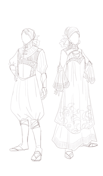 While I liked this a lot, I didn't feel it was a fit. I reflected on what I'd done right so that I could improve on the next attempt. I narrowed my focus and took inspiration from a few key sources. I liked the drape and color of the outfits found in a picture I saw of Masai women's clothing. I liked the type of clothes and the cut used in traditional Russian clothing that my research turned up. I made sure to work on cohesion in the designs. I used the triad colors of red, blue, and yellow as I was inspired by traditional Sami clothing. The final piece includes surface design achievable by techniques such as batik, bound resist, tie dye, and other dye techniques. Low-water dye baths turn up some great mottled effects, and I tried to replicate that in the color version of this sketch. Many surface design techniques can be used to add adornment when the wearer does not have the time or money for fine embroidery and jewels. The fabric would be simple and cool for the warm climate of Saaliet. The bright colors are the only thing carried over from their distant homeland, which is cold and covered in show nearly half of the year. All garments have loose drape, allowing for ease of sizing and wearability by anyone. The sketch is below, but the final version is in my portfolio here. 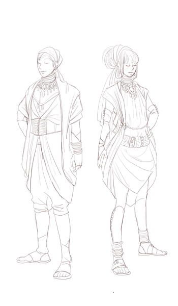 Two more chapters to edit! I've begun to wonder if I should bring all elements into the safe zone, or allow for full bleed. Below is the original image, from 2012. While editing I have had to move word balloons, sound effects, and art. It's sometimes quite drastic, and I began thinking about the aesthetic qualities of simply bringing the entire page in, leaving a white margin. I can't be sure what the print margin is, so I can't judge where it will be cut very accurately. I at first did not consider it because it, but when I saw it done for other comics I noticed it looked fine. Several edits ended up like this, so it is worth thinking about making it consistent. (Final printed pages will have the same textured appearance, but will become grayscale to save on print costs.)  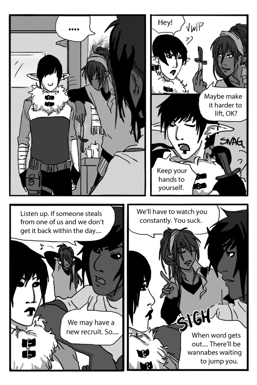 I've been editing for printing my first volume of Spidersilk, as I mentioned in the past post, but there is not much to actually show. It's more of the same -- moving word balloons, continuing art, resizing pages, tweaking dialogue.... But I do want to keep sharing processes here, so I'm going to share my general process for making a character armor design. This character is from Spidersilk. He's a weapons and armor fanatic and I wanted to redesign his armors. Every time I draw him his armor is different, and though he's got quite a collection I doubt it'd be reasonable for someone masquerading as a Carriage Coach to have several sets of fine armor! Let's move onto process. The first thing I do is draw the form. This was the first time I drew a shield, so I drew it right into the form as well as the sword (for balance). 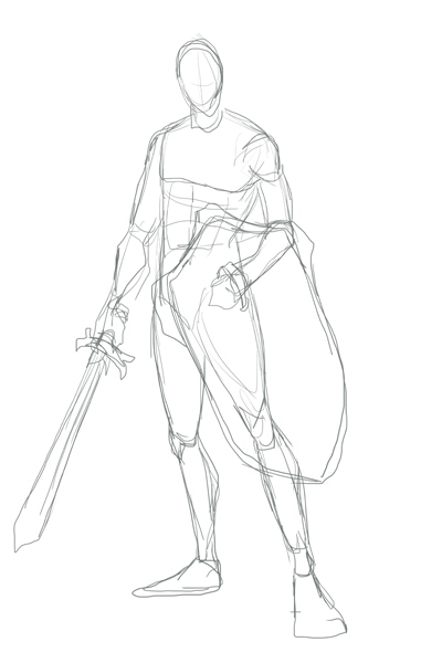 Next, I lower the opacity on the form and build the armors on top of it. Here's an image of that sketch over the form (shown in red here). I tend to not draw helmets. But if I were to send him into battle, then yes, I'd put a helmet on him. Even when playing games I use the "hide helmet" option and my dude in SKYRIM always wears a thief hood. I just like it more, aesthetically. 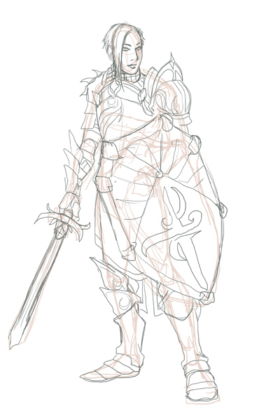 Next I'll show the sketch and the lines. I may change the designs on things at this state. That is simply a placeholder. 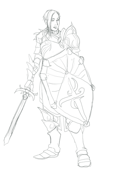 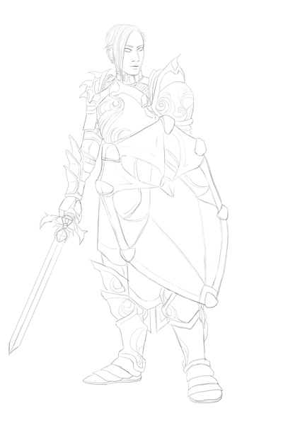 I kind of liked that sketch as is but decided to clean it up ... and make the sword not wobbly. Embellishment makes armor look fancy very easily, even if it's just a simple trim. Check out those swirling patterns! I was playing Dragon Age: Awakening again and when King Alistair marched up I admired the embellishment of his armors and decided to try embellishing armor with that inspiration. Below are the flats and some simple shading, with the final at the end. 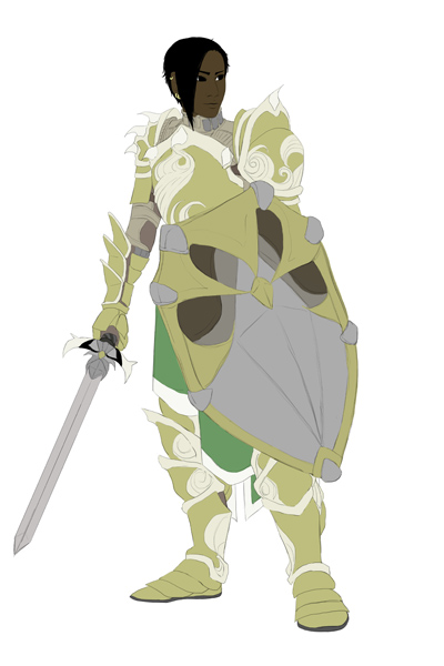 Now, I generally color willy-nilly as I like. I will do flats for, say, the shield then get really excited and render the whole thing before moving on to anything else! But I forced myself, for the sake of this example, to do all the flats first, as you see above. Notice that you can see his arming doublet under the armors at the neck and under the pauldron/spaulders combo and gauntlets; it's why those areas are not gold. 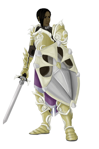 I wanted this to look a bit more warm, so I tried out some textures and effects. I may have said so before, but I use textures from this artist on deviantart. 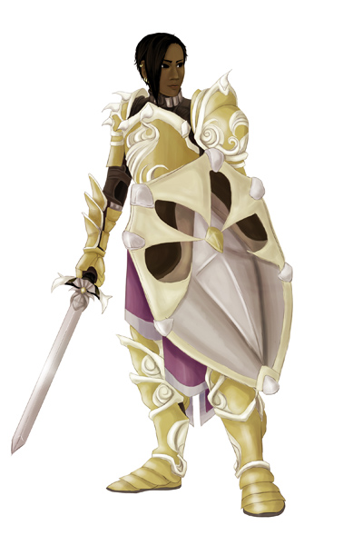 The whole process took about three and a half hours. If you like this, be sure to check out my gallery. If you're into webcomics, read Spidersilk here!
I've finished the set-up steps and am going through the book's layout again. I will from this point forward make sure my comics are easy to edit just in case I have to edit more at some point.... The first two chapters are brutal because of the poor layout, and I have to redraw three pages because of mistakes in saving. To be fair, it was my first foray into digital comics, and I've learned a lot since then. I'm looking forward to scanning and making concept art collages for the special behind-the-scenes chapter! Here's one of those early sketches (about 2010/2011) and some linearts (about 2013). 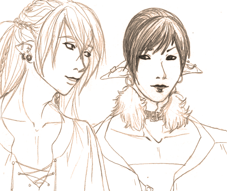  |
AuthorComic Artist Archives
December 2015
Categories
All
|
 RSS Feed
