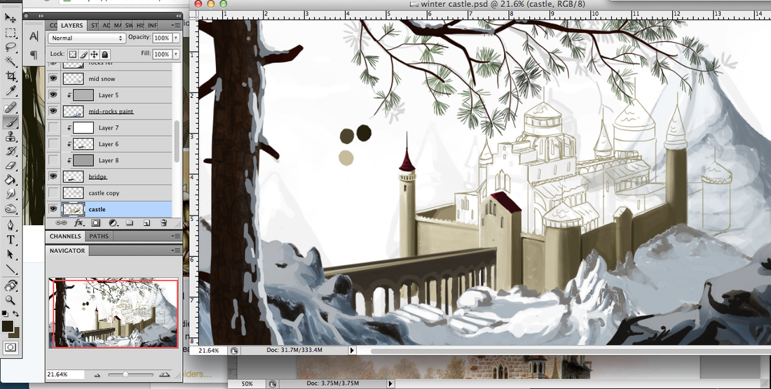
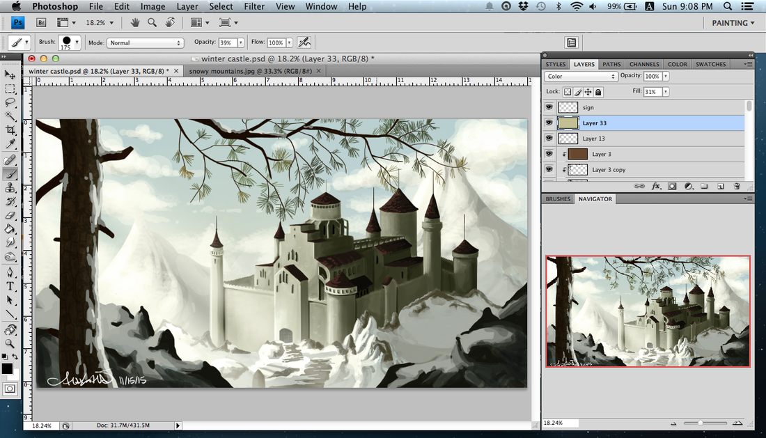
  Five hours in on my current environment concept art. First time painting snow ... or maybe the second, but these things have certainly gotten better over the past year! I took out the bridge. It was kind of terrible and I could not get it to work, nor did I want it to take away from the castle itself.
This is done in the way I learned game concept art, but I am doing this for an area that will show up later in my comic. I figured it was a good idea to do pieces for the different cities or areas!
0 Comments
In the earlier post on Dragon Age fan art, I mentioned that I had a great reference for Varric and had learned from it, while I basically winged it for everyone else and ended up spending a great amount of time on shadowing. For whatever reason, clothes have always been easier to shade than faces. Earlier I visited my old university and saw some class exercises in the works. The students had taken photos and it appeared as though the photos were run through different photoshop filters. The students then recreated those images. All were in greyscale. I assumed this was for value studies and shadows, but I don't know for sure. However, it struck me that this was a great way to simplify the shapes of the shadows and highlights and I could approach shading with this structured exercise rather than flailing about until it sort of looks right. So, I looked up a 3/4 portrait and put it through a couple of filters on photoshop. Here's an example of photo with the cut-out filter applied. 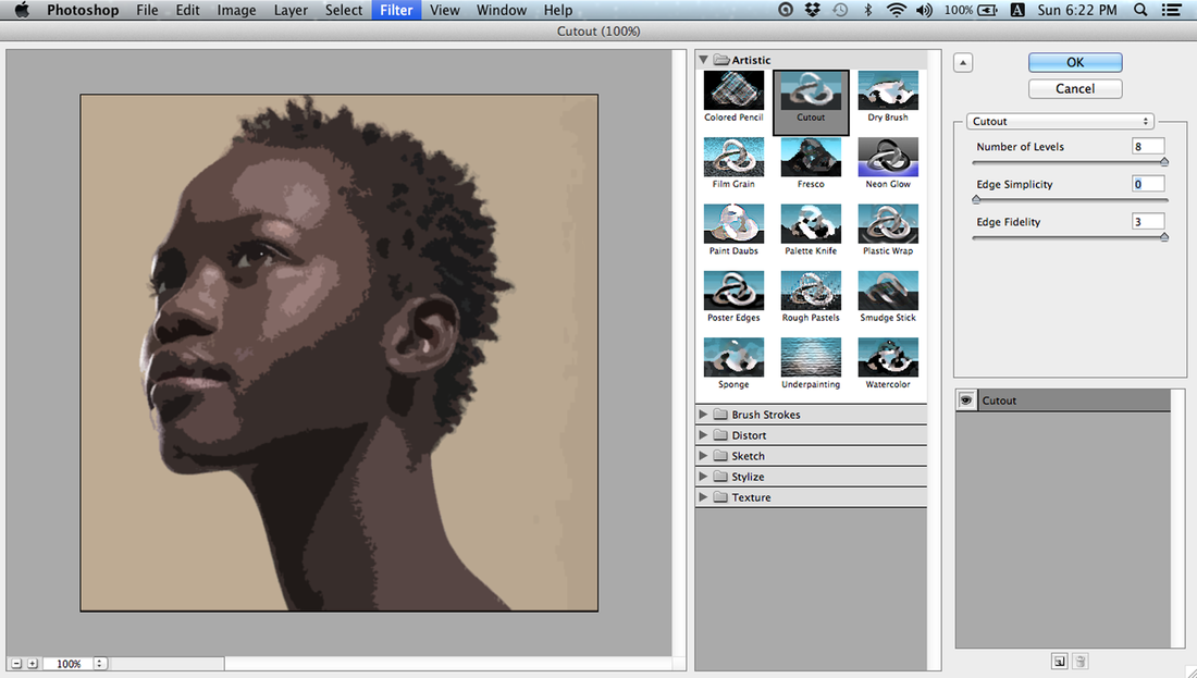 I did this with dry brush, cut-out, stained glass, and palette knife. The stained glass one was purely to separate colors into neat little shapes so I could color-pick easily. I traced* the woman's face since I am focusing on painting and shadows, and thought it would be best to focus on one thing at a time. Here are the results of my paint re-creations of those filtered images. *While I did trace her face, I did not trace the painted portion; however I would recommend that as a first step if you are really uncomfortable with shadows! My re-creations are not perfect, but I attempted to put in every small detail even if it seemed odd. I am not one to question the photo reference, just learn from it! 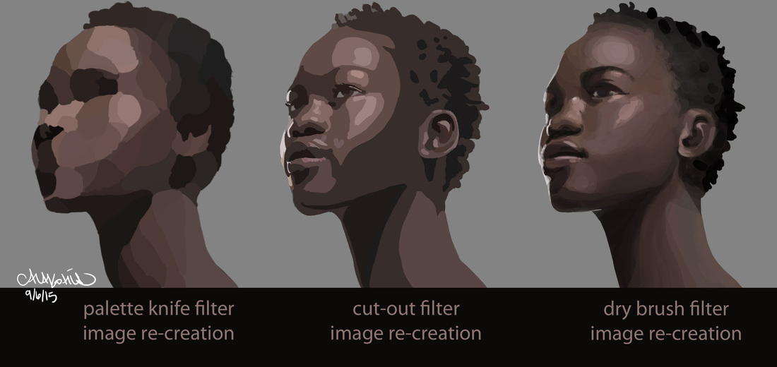 I believe going back to that Dragon Age fan art now will be so much easier for shading! I will probably do this with a few different photos for some more practice. The searching, preparing, and filtering took a minimal amount of time, maybe five or ten minutes max. Most of the two hours spent on this exercise were on painting, much of it on the first and third images.
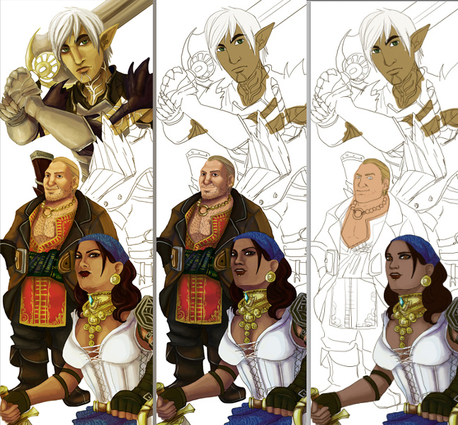 I started a Dragon Age 2 fan art about a year ago. I liked the sketch so much I didn't advance on it -- then a Dragon Age poster competition came out, and then Inquisition and well. I think I'm done playing DAI for the moment, so I switched my focus back to this as a fun side-project to pick up new techniques and as something to work on outside of my own comic projects. It's fun and I look forward to dabbling with it every day. I paint a character a day and sometimes dabble on the ones I had finished (or like Hawke, who is a giant focus, was partially painted on the same day as Fenris). I had a great reference for Varric, and was able to do his face shadowing pretty well. I have been left to my own devices on everyone else's shadowing … with varying rates of success. I am learning a lot through this, and will start up another fan art to pick away at daily. Probably Mass Effect. I recently fell in love with it. Anyway, I chose to add a custom Hawke and Bethany to honour my own playthroughs. I am not making this to sell or print, and I think that takes a lot of stress off of my shoulders and gives me the room to learn and try new things while paying my respects to one of my favourite games. Today I worked on Bethany. 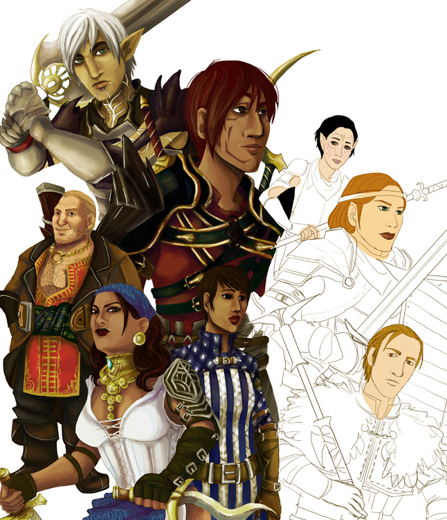 It's been a couple of months since posting, but I ended up doing a lot of commission work that I was unable to share. I'm making it a point to do extra work for sharing recently, and have found it makes me even more productive! I am going to share some of the fashion sketches I began doing after checking out "Fashion. The Definitive History of Costume and Style." While looking through it I began doing sketches on armours, dresses, even hats. The hats are my favourite, so I will share those. These may become something more, but for now, I like them as is. 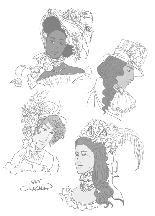 The novel I wrote something like 10 years ago has been pulled out of the dust once again. It is going through its final, nit-picky edit by the first person to have read it in full and provided feedback. I think that's kind of nice to have brought it back full-circle! In any case, it will be released on kindle in march. I am aiming for March 10, though due to word issues and formatting it could be later on in the month. Here is a cover concept I am working on. It will be in both colour and grayscale as there is the likelihood I will prepare for a short print-run and sell them locally. 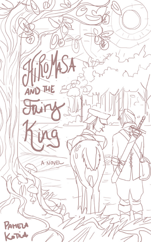 Color test for the armors. I am drawn to the more muted ones. Since the point of this was to experiment with shapes, using muted colours or a monochromatic scheme would make it more about the shape and silhouette. A final version will appear in my gallery, so this will be the last post on this particular piece. 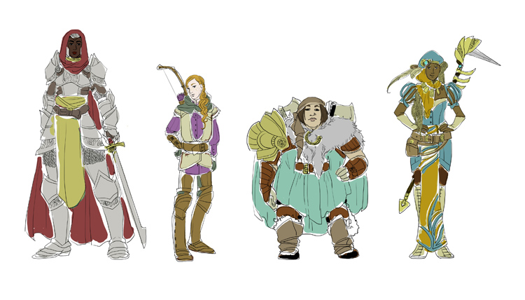 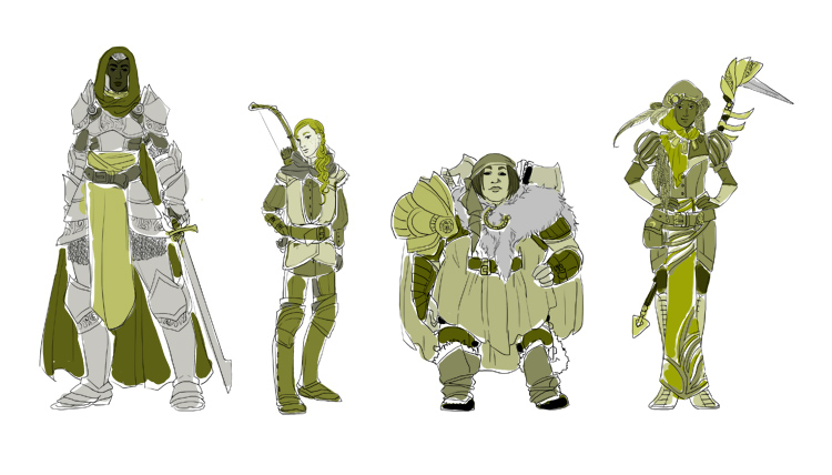 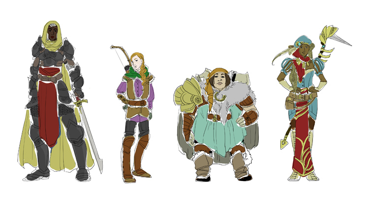 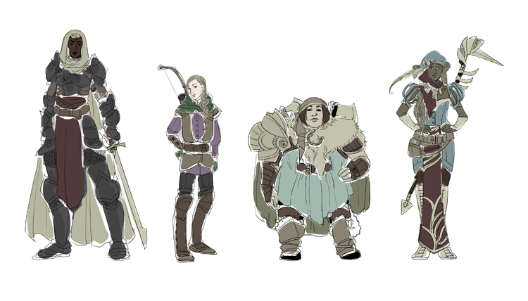 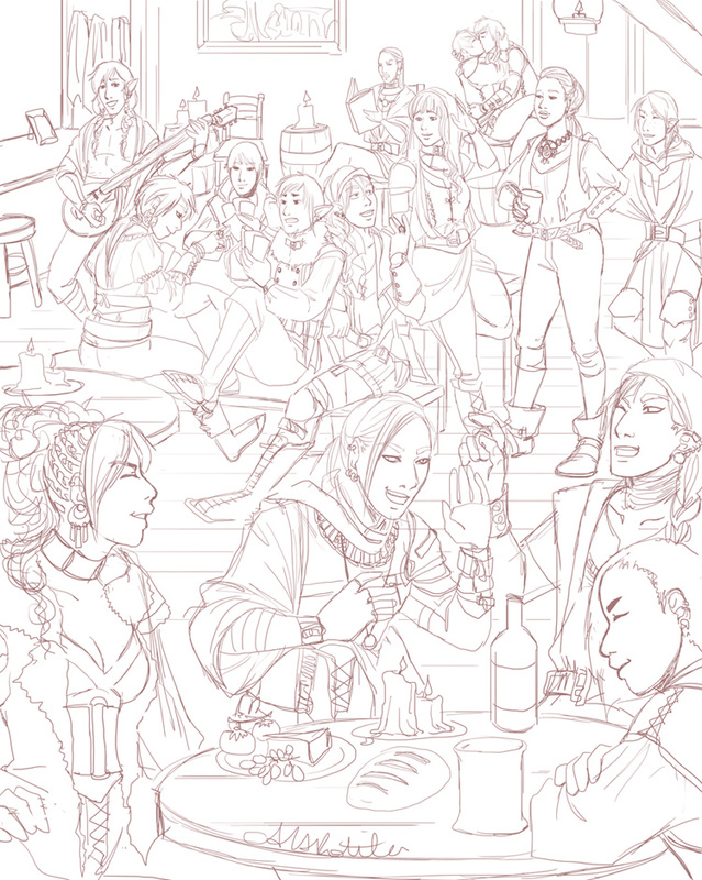 Working on a crowd scene for my comic Spidersilk. I've been wanting to do one for some time, but the comic takes up most of my illustration time and it is important to put out story content. However ... and yes this does explain my hiatus from the WIP blog ... I got and beat Dragon Age Inquisitions. I was so blown away by story aspects, so wrapped up in it, and so pleased at the little character and world details. A particular cut scene made me really want to do a big tavern scene, so I did this. All kinds of inspiration built up as I played, so when I beat it I let loose with illustrations (though most are of my Inquisitor -- I'll share those later)! When I play great games, watch good movies, etc, it just makes me want to make stories that hit as hard.
After working on that large Dragon Age II fan art, I felt a bit more confident about drawing such a thing. This is the first time I've done an image with so many characters AND a background, and I'm actually looking forward to the long inking process. On September 26th, my comic turned three years old. It was launched in 2011 on that date, though under a different name. The first half year for Spidersilk was tumultuous due to the steep learning curve of using a tablet (as well as other issues). I renamed it and doubled efforts on updating after half a year. I threw myself into networking and advertising as well. It built slowly, and after it became featured on Inkblazers.com things have been gliding along. It picks up on average 30 new readers a month and ranks in the top half of all featured comics on inkblazers quite consistently. The comic must come first, above other projects (as fun as they are!) and I have been spending much time on it. For the third anniversary I initially thought I could get the copy ready for print, and that is still in the works, but I haven't completed the necessary work for that yet. So ... I decided to do a promotional event, for whatever I can manage at my moment. I am reading "Console Wars" and it makes me want to aggressively market something, anything -- good thing I have a comic! It made me think for quite some time on what I could do with what I had, and what was going to be the most beneficial for the comic. So, I basically asked fans to share the comic, and add why they liked it. Simple, takes little time, is fairly easy for me to track entries, and will give me a really good idea from otherwise silent fans what it is about Spidersilk that is interesting, unique, and catches attention to better help me promote it in the future. (Tumblr post details) A week ago I began drawing this to put up as a thank you to readers. Clothes-swapping is always good, though I don't know what the heck Prentice (far right) is doing. He is either not a very good fashion model or an exceptional one. I can't really tell! 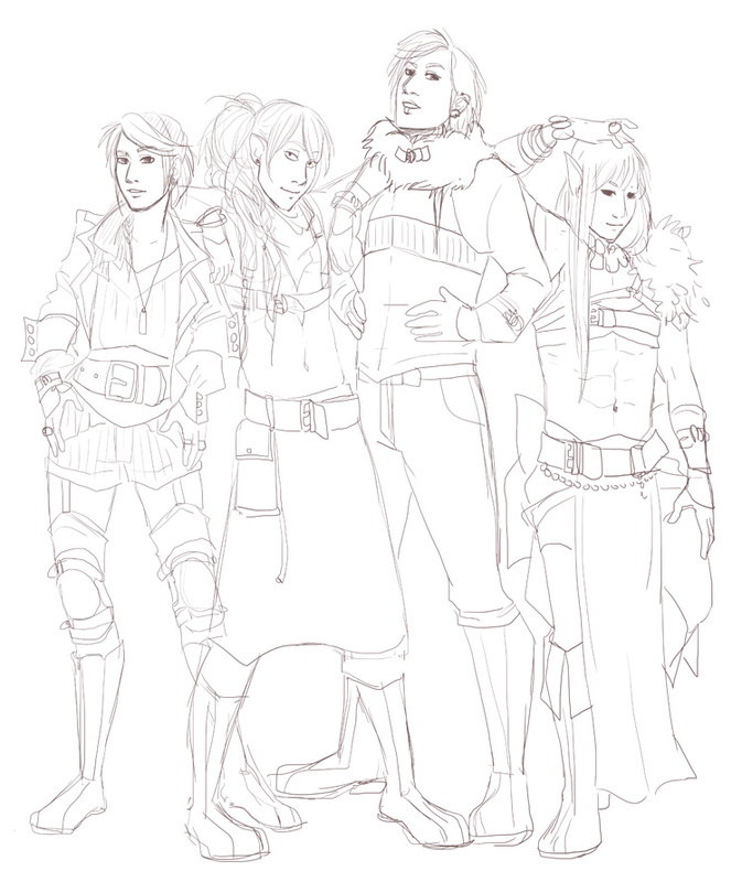 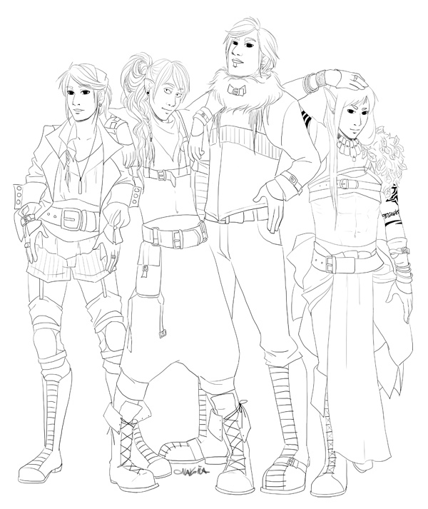 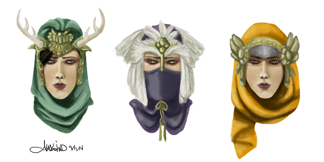 Here are the promised (per the previous post) mage hats on the unimpressed Morrigan (of Dragon Age).
I sat down to design mage hats and was stumped. There are already a lot of colorful hoods in Dragon Age, with about half of them being a bit too goofy for me to want to wear.... So I decided to throw caution to the wind and went colorful and flamboyant to see what would happen. I often practice in extremes before I settle when working with something new. Process: First I attempted some speed painting for Morrigan. I don't quite have the hang of it yet, but I am now enjoying it. Then it came to actually making the hats. I drew silhouettes first, then layered colors on top of that. As for the designs themselves, I began to think what is it that makes a mage hat a mage hat. A simple cowl or hood would probably look best for a game character, but in terms of practiced actual magic, items hold meaning, embody certain gods and goddesses or their traits (ie protection, war, archery). I thought about items people have worn in the past, sewn into clothes, to avert the evil eye, call luck, etc. Colors are also associated with certain traits, magical or not -- red with passion, aggression, etc for instance. I chose bright colors. For decoration, I decided natural items were best: antlers, pearls, feathers, gems, etc. Particular patterns, visible in the far right mage hat, might evoke some sort of magic or ritual casting. The hats are still undergoing critiques on my social media. It seems like favor is swinging between one and two. Inspirations: The first hat was done on thinking about the "Green Man," the god of the hunt, present in much of Celtic paganism. He is often depicted as wearing green and with antlers of some sort. The second was a lot simpler -- it was based on an owl. The cowl was initially a rich purple as I'd decided on bright colors, but it made the overall hat look a bit like the Shredder (TMNT). Finally the orange one quite literally has a hat brim, and was based on some of the Jaffa helmets from Stargate SG-1 (Horus guards, I believe, with the bird sort of appearance), though it's not too evident it seems. Now that all the moving from country to country thing is settled, I've had time to get back into a schedule. Spidersilk is updating three times a week and commissions have opened! Below is a commission for six costumes for a D&D character by northernvehemence. The character is a bard who raps, and the world is a bit steampunk. I was pretty excited by this one! Very fun to do. 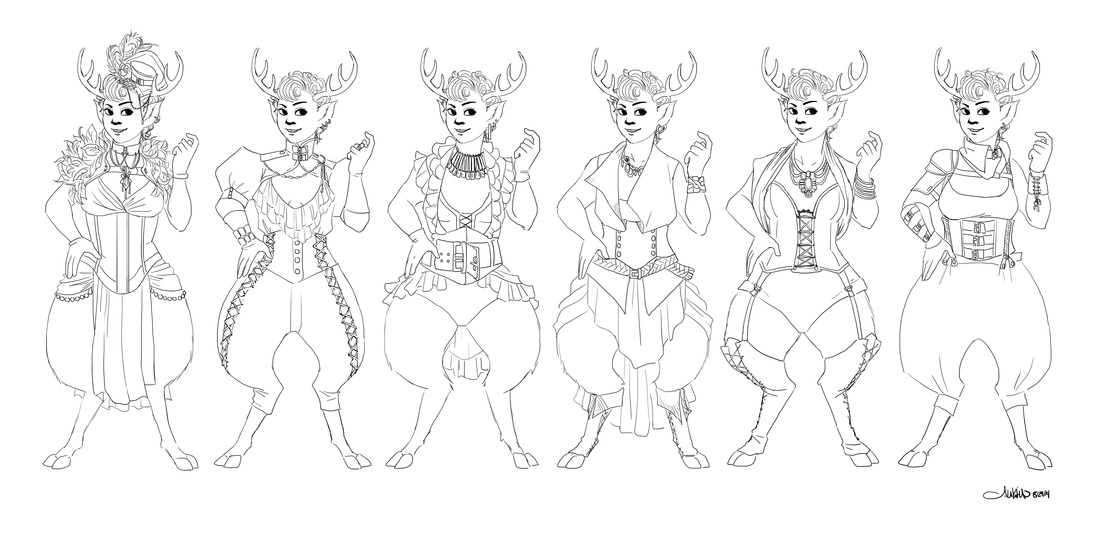 I've also been able to do a fair amount of personal illustrations. My recent one is a romantic fantasy image. I really wanted to do this one because I don't find the pose all that romantic yet I have seen it in a lot of places! I have this thing about drawing cliche poses -- in fantasy, pin-ups, whatever. Otherwise my "couple" illustrations are a bit weird, and they are always doing something like reading or eating for some reason. Anyway, here's the sketch. The final version will appear in the illustration section of my portfolio. 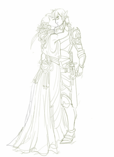 WIP Since this image was fairly successful (even with this pose!) with its flat coloring and dusty palette, I might try out something similar for the elusive Dragon Age fan art I keep trying to do. My Dragon Age II is somewhere over the ocean on a boat being shipped from Japan to home, but I could always make up a new Hawke. I have about six of them anyway!
|
AuthorComic Artist Archives
December 2015
Categories
All
|
 RSS Feed
