|
As I said in the previous post, I like the load screens of Dragon Age II quite a bit. (I don’t know if they are different on PC; when I looked for images, I found a couple I had never seen while playing on PS3.) Here is an example of one of the load screen images. 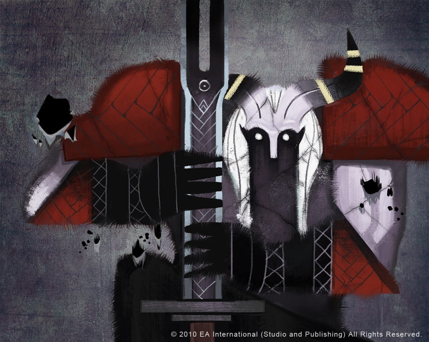 I tried to keep my illustration trial as simple as possible, allowing for the smallest amount of detail in the face and also the chainmail. The picture above has more linework, but I wanted to rely on silhouette ... or at least try it. A lot of my character illustrations are detail heavy, so it was difficult to keep it down to simple shapes to try and convey this character. I had to force myself to stay on track and just move ahead and see how it turned out; I decided if it went poorly I’d try again and allow my detail urges to be satisfied, and I would more clearly render the armor I’d drawn up in the sketches. In the end, I was pleasantly surprised with this trial. About an hour and a half, maybe two (as I was experimenting). Photoshop. 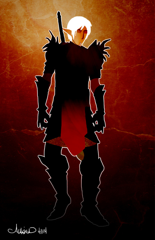 When that was done I added filters. I get mine from this user on deviantart.com: Sirius-sdz
When I added the top filter I ended up with some of his hair showing a bit, just this white line around the crown of his head. I decided to either erase it or run with it; so I ran. I incorporated it into the rest of the image, fading it out near the bottom. That layer is on luminosity to help with the glow effect. It was challenging yet relaxing to work with minimal shapes and colors. I want to try images of this sort for my own comic, but that’s for future trials – a few projects came up very suddenly and I must attend to them first, while keeping my comic updated. More on these projects next time!
0 Comments
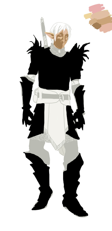
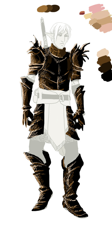
These are a few things I'm working out. The second redesign won out but with the suggestion of changing the cloth color, so I'm trying some quick paints directly over that design.
I don't quite like where it's going but this is a good chance to experiment. I'm done with the concepts so now I'll have some fun with them and do some illustrations. I like the simple images that show up on the load screen of Dragon Age II and in the book the Seeker gives Varric, so I may try one more along that style, as well as one in my usual style (that I use for my comic). Today we'll look at some redesigns. First, here are the original armors again. Scroll to the previous post to see more about this design challenge and why it is happening if you are new to this blog. 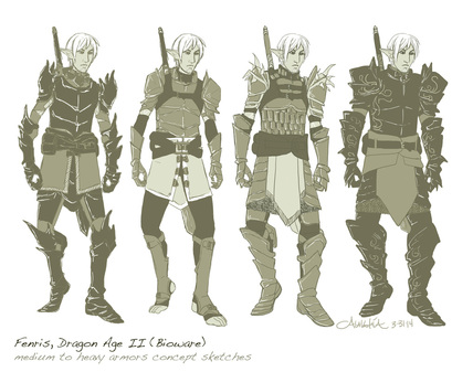 I posted these on various social networks and though it got attention on tumblr, I didn't get feedback. The facebook community responded, though. The third and forth armors were the favorites, but the first one did get a bit of attention as well for its spikes. Most people chose the fourth armor as being the most practical, while others chose it for its design balance. Many chose three for its spike detail, for its nimble appearance, and the leather strap detail on the cuirass also got a vote of confidence. Others yet said they did not see why he couldn't have four sets of armor - I agree. But the design challenge was for narrowing a concept down, revising it as I went. As you see below, I've pulled armors three and four for you again, and posted the redesigns. Quite a few chose both three and four when asked which they liked. Some people seemed to favor the actual size and shape of three, and others the look and balance of four. Therefore, I used the base of three and first darkened it and added embellishments. However, it ended up looking busy. I tried again, and made the redesign dark, including the spike detail, to mimic the look of armor one. The silhouette really popped, and the asymmetry was more apparent. I changed the cuirass slightly to take down the busyness of its armor plating and removed leather detailing to more closely mimic the cuirass of four's. The leggings are also now black to improve the overall sleek look that people seemed to enjoy in the armors one and four. I believe the second redesign is more successful, but I will get some opinions. If I redesigned this on my own, I would have gone with four right from the start. Designing based on feedback from others has been interesting, and I like the revisions quite a lot - something I would not have gotten to otherwise. Immediately below you will see armors three and four again. Below them are redesigns one and two, made from combining details of the armors based on feedback. 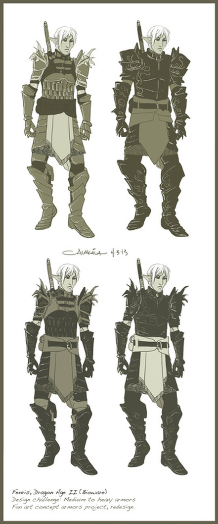 First of all, I needed a good clear image of Fenris' existing armors, and a pretty clear shot of his face. I didn't intend to go into detail but I have found catching 3D characters' likeness in 2D sketches to be a bit of a challenge. These are the reference images I used, both are game screenshots I found in a search online. 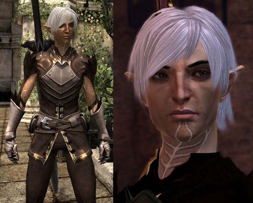 To reiterate, I'm not doing this because I think his armors are terrible. I really love the aesthetic and feeling of Dragon Age and Dragon Age II, and I'm generally not so good at fan art. I probably wouldn't have thought of doing such a project if I hadn't seen someone reimagine a costume for another game character on deviantart! I love drawing armors. That seemed like the sort of fan art I could get into. I thought it'd be a neat challenge. His face was the hardest challenge I think. I really did not want to mess him up. I tried to give myself a pep talk: "No big deal, just draw him like one of your Spidersilk characters ... dang it! Too pretty." I somehow captured his essence. It could be luck. And I drew his head last, momentarily wondering if I could get away with designing armors for him without actually drawing him.... For shame! Anyway, I wondered what armors he might choose. The first one, far left, is based roughly on existing shapes and silhouettes of his outfit. Then they just got clunkier as I went, winding up with massive black armor of doom at the far right. I like that one the best. I'll be collecting opinions on shape, silhouette, details, etc and will use them to bring one of (or a combination of) these armors into a more fully realized painted concept. Done in Photoshop, each one took 35-45 minutes. 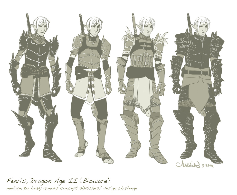 I love drawing armor and have been drawing it extensively for the past two years or so. I would like to try designing armors and weapons for an already set character from a world I have come to know and love very much -- Dragon Age.
I've decided to draw Fenris from Dragon Age II, by Bioware. Fenris is a warrior, but his armors are very minimal. Though I very much like the aesthetics of Dragon Age, I have been wondering what heavy armors on Fenris would look like. What would he choose? I'll want to keep the general aesthetic; as Varric says, it screams "I hate you all! I was a slave!" This should be a fun challenge! Sketches are forthcoming. |
AuthorComic Artist Archives
December 2015
Categories
All
|
 RSS Feed
