|
Here are some ideations for Prentice’s sacrifice dagger, as mentioned in the previous post. In Spidersilk, mages who cannot harness the full natural energy of magic and only the basic primal energy of blood are called “syphons.” There are all sorts of rules and limitations to syphon magic, but that’s not the point here. Prentice is such a mage, and he usually uses his own blood. It is why he carries a small knife or dagger. At first I decided to try a new sort of dagger than the one he usually has in the comic. His last dagger looked more like some kind of combat knife. He will use the dagger as a weapon but he prefers to use it only for magic, which is why he’s usually otherwise armed. 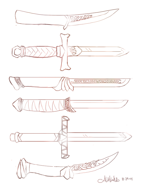
Since it has such a specialized use, I decided it’d probably be ornamental, maybe pricey, and likely have spellwork or runes engraved right into it. He always has it and it clearly means a lot to him, though why hasn’t been revealed yet. I thought I should play up making it as distinctive as possible.
He’s got his summoning down to an exact art, able to form a summoning portal with two gestures, throwing blood from his arm and the knife. The knife should have some capabilities of holding onto his blood to facilitate a fairly even distribution when he does this – that’s when I started ornamenting the blade with small indentations rather than what could be ornamental spell support. You can see that on the last blade. I don’t like any of these blades as is for Prentice’s purposes, but I can see some of them getting reworked for the final design.
0 Comments
When I do fan art it is usually a copy of an image so that I can pick up ideas or techniques from the artist, or it is a redesign of someone's clothes or armor. That's one of the ways I got into comics in the first place -- as a child, I used to trace Betty and Veronica from Archie Comics and then redesign their outfits. Comics and fashion go way back for me! I have only done illustrations of my own composition for other webcomic artists, though this hasn't happened very often. I want to try this again to challenge myself. I am going to work up some ideas for concept. Because my concept isn't that clear yet, I won't discuss it. I will say that it will be for Dragon Age. Last, I will share some bizarre fan art I made for a friend. We make absurd fan art for each other, and this masterpiece came to mind after reading her community challenge blog with the theme of "heroic." Things quickly got silly. I secretly blame Lord of the Rings for the strange monster. (Read her comic here, a sci-fi romance called Bio-Revelation.) 
I've finished the set-up steps and am going through the book's layout again. I will from this point forward make sure my comics are easy to edit just in case I have to edit more at some point.... The first two chapters are brutal because of the poor layout, and I have to redraw three pages because of mistakes in saving. To be fair, it was my first foray into digital comics, and I've learned a lot since then. I'm looking forward to scanning and making concept art collages for the special behind-the-scenes chapter! Here's one of those early sketches (about 2010/2011) and some linearts (about 2013).   The Skyrim comic samples will be coming a little later. I've just started the process for getting the first volume of my webcomic, Spidersilk, published as a comic through Inkblazers.com. The process will take a month and a half or two, from start to finished product being available in the store. The option to print is reserved for featured and premium authors, and after I was promoted to featured in February, I began planning for this step. I did consider redoing the first two chapters for some time, and finally asked for the general opinion from fellow artists on the website. Redoing is a case-by-case decision, and I'm not for or against it. For my particular case, the pros were not strong enough against the cons, so I compromised. In any case, it was more important to continue the story at its current pace than to redo something that wasn't entirely broken. Yesterday I laid out the book's proposed content. Chapter six ends at a suitable (though quiet) moment of suspense, so I will end volume one there. It is also roughly 100 pages of content at that point. I am including a chapter of concept/ behind-the-scenes works including early sketches for the characters and for the very popular magic summon, the Ambassador. Some of these early sketches have never been seen by anyone but me. I noticed a lot of creators on inkblazers offer such a thing, and really ... I am very interested in that kind of information about my favorite stories! My next step is to begin working with the provided templates, and make further edits if necessary. I have some experience in editorial design and laid out my first comic for print (in two different sizes) for my final illustration project, and it's something I enjoy doing. Publications were some of the most interesting classes I took in the digital art department, but I'm no expert. If I run into trouble, I will get assistance. I have to edit it anyway to make it print-ready, and as I did this I made minor revisions: adding/removing/changing dialogue, breaking up the word balloons, moving word balloons, adding sound effects, etc. In some cases I redrew a panel or two. Shuffling the panels around was a nice challenge, but it was time-consuming! I wish I'd planned to print from the get-go, rather than assuming it'd always be a webcomic. Too many important elements (art, dialogue) are in the margin. Still, some part of me thought I may print since all pages have a 5x7.5 save at 300dpi. I can be thankful for that preparation at the very least. This is not my first comic, but it is my first purely digital comic. As I went along, my process refined, became quicker, and the later chapters are much easier to edit! After the chapters for the book are edited, I'll go through them all and do a quick test-print of some of the poorly saved pages to determine if they must be redrawn or not. Below you'll see the cover I currently work with. and below that cover, some page edit samples. Click the cover below to be brought to the comic. 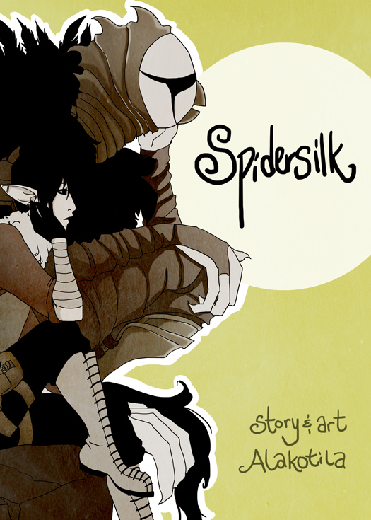 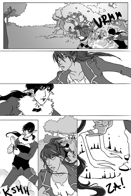 Above, the very first version of page two, chapter one, done in September of 2011. I'm not even sure of the time taken, but every page was painfully slow and required me to edit the linework in illustrator since the tablet was so new to me. Halfway through chapter two I no longer fixed up lines in illustrator, and for the past several chapters the timeframe has been in the three to five hour range (with few exceptions). Below, you can see the minor tweaks I made to this page. Now that I've posted this, I see that Prentice's hair is still shiny and I don't like that! I began doing his hair simply black by chapter three, so I have to change it in earlier chapters. That's what editing is for! 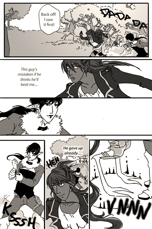 A friend of mine does comics related to games she's playing when she's not hard at work with her original comic series. I've always wanted to do such a thing, make a few comics about games since I enjoy reading them. I never had a very good idea, and fan art can be quite taxing. Now that I'm doing a consistent original fantasy series, it wasn't a smart idea to take much time from it. However ... I was talking with that friend about something that'd happened in my recent playthrough of SKYRIM -- so first, a story. I have the Hearthfire DLC, and immediately built a house and adopted two children, one of whom immediately adopted a nasty, loud skeever. The thing grossed me out and I read somewhere that the kids wouldn't care if you got rid of it, even if you killed it right in front of them. I finally worked up the guts to do so, hid in my alchemy tower, pulled out my bow, and took aim. Please note my stealth is always insanely high. Bullseye! But ... the kid fired out of the chair, yelled that he hated me, and ran away. My other child did the same when I approached her. They both ran away yelling curses. I was distraught -- "I was told they wouldn't care!!" In any case, I left the house and came back hoping it would clear up in time. By default, one of the children ran up to me and asked me to play tag. So I said yes, relieved they were over the skeever thing. As I ran after one of them they shouted, "Go away I hate you!!" It was so pathetic I just restarted and have to deal with the skeever even now. My friend and I began imagining this and other happenings through the Dragonborn husband's eyes. My Dragonborn married Farkus, from the Companions. You know, being married to the Dragonborn may not always be as exciting as you would think, especially when he may not be all that epic.... And let's be honest about the hilarity of SKYRIM glitches. The armor dummy walks around the top floor of my house every time the Dragonborn comes in through the 2nd floor door. Does that hurt gameplay? No. Is it scary? Quite. Did I put goofy mismatched clothes on the armor dummy to teach it a lesson? Maybe. And thus "Diary of the Dragonborn's Husband" was concocted. I've been thinking about it for some time and have revisited the idea, so I think I've got something worth attending to! The initial sketches were simple, with a line or two from Farkus' diary concerning some event that'd happened, with intentional misunderstandings of the Dragonborn's reactions (since he's supposed to be heroic). I want to change it from that somewhat, though I do want it to be in a diary format. My first task will be to come up with a basic layout for each entry, or page. I'll post those ideas later, but for now, here are some WIPs from the initial idea. Immediately below are some notes on the Dragonborn's appearance, and at bottom is a sketch of a diary entry. 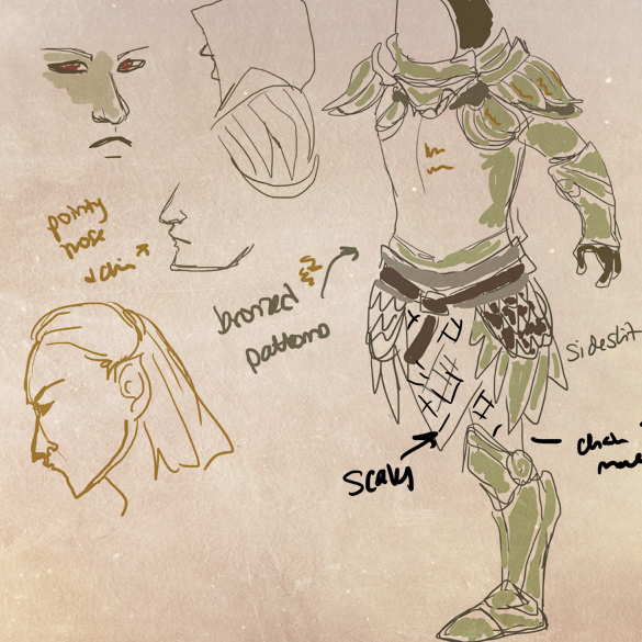 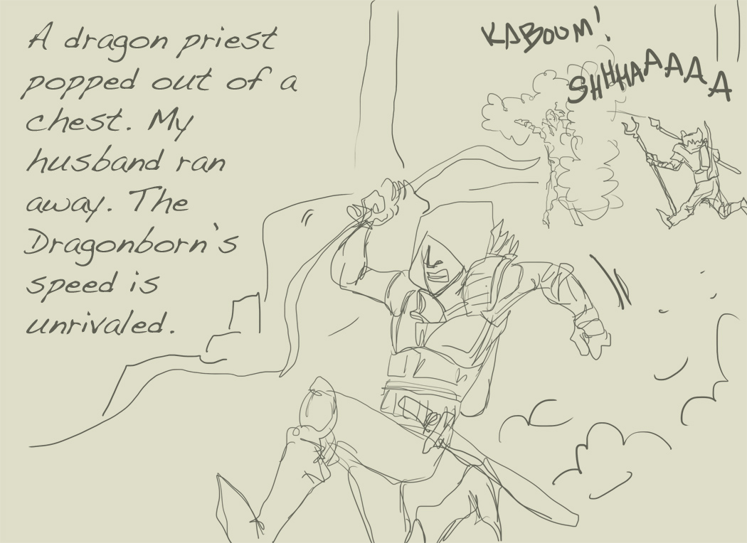 A member on Inkblazers is holding an OC tournament, as mentioned two posts back. The deadline was two days ago and the entries are now being judged. It is fine to release the sketches and thoughts behind the process now. As mentioned, I was assigned the comic Shapeshifter: A tale yet Untold. I carefully read the comic. I have looked at it before, but I wanted to make sure I understood the world, as it is quite detailed. Reading a comic with the intent of creating a character for that universe was a strange experience, but I do not think it detracted from my enjoyment of the comic. On the other hand, I think I might have understood more of it since I was so focused while reading it! Though the comic focuses mostly on Outbreaker characters (those who have been possessed by supernatural beings and therefore have heightened abilities), I became quite interested in designing an average human character. I wondered what the average human would be doing in such a world, and being that much information on humans was not given yet it was a bit of a stretch. I also considered creating a cultist character, but I understood less about them. Here are four sketches after I decided on a human woman. 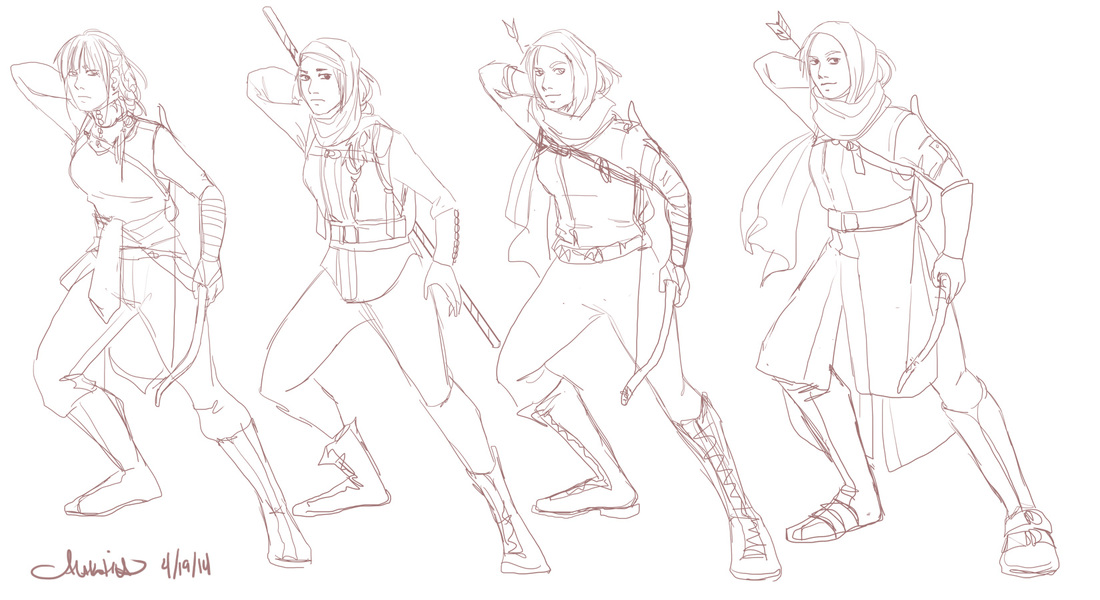 I thought it was highly likely humans would fight for themselves and their own survival, though there would be those depending on the strength of others (Outbreakers, mainly). There was quite a sad chapter focused on the plight of the humans, especially poor ones, from one of the great cities. I thought the characters were quite strong, but I still wanted to design someone who had taken it upon themselves to help not only their family, but others, and had taken the steps to defend herself ... and thus, she is armed, and belongs to a group of like-minded humans from her city. Here is the final line art, and below it, the description released with the finished image on Inkblazers.com. 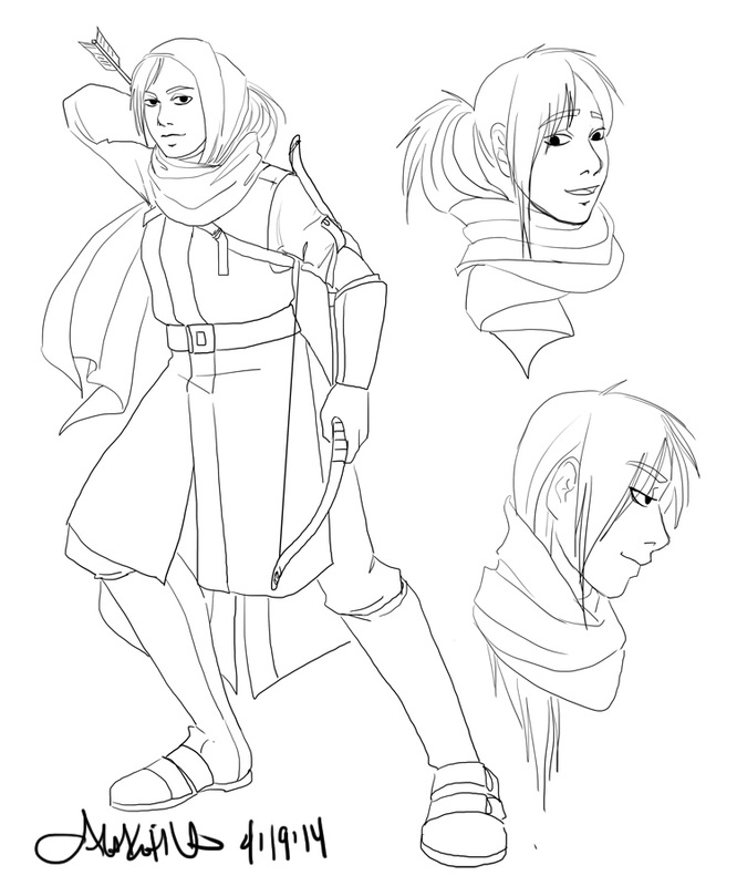 Name: Shani
"Humans are protected from the monsters roaming the lands by warriors, by Outbreakers. In a city of little importance, things were going downhill. Only two Outbreakers roamed the area, and the situation within the walls was desperate. Most people went without food for days. Foraging for food was dangerous, and many never made it back. Tired of depending on others for their survival, some humans banded together to look after their own needs. It was humans that saved themselves 1,000 years ago, and though that time is forgotten, the human spirit is strong. This band roams the wilds, hunting and foraging, so that others are not compelled by hunger to leave. Shani belongs to this band. She specializes in archery, as a guard for the hunters. She is quick and silent, her sight is keen. She doesn't resent the Outbreakers, but moreso the apathy of many humans. This group's acts may be small, but many rely on them." The character contest mentioned in the previous blog entry will end on the 20th. I'll release the sketches then. Today I'll share the basic process of one of my comic pages. I've been doing webcomics for ten years, though I hit a rough patch of updating while I was in university. However, Spidersilk will celebrate its three year anniversary in September and has been going strong. It was promoted to "featured" on inkblazers.com in February. Each Spidersilk comic page takes about three and a half to four hours. A very detailed page can take up to five. Since I tend to do scripting and storyboarding altogether before drawing, it is hard to determine the exact amount of time in each page. The bulk of the comic is monochrome, but first page of each chapter is in color to help readers visualize the world. It is the page that sets many of the colors for the rest of the chapter, and this page is usually more detailed to help set the scene. I had to draw horses and a city scene for this page. I have drawn only one horse in the past four years and have little experience with city scenes. I've been doing horse sketches to prepare for this chapter, but for the most part I didn't line or color them. I just needed proportions and to get comfortable. (I am not comfortable with them, but I suspect by the end of this chapter I will be!) Though each step for this page took longer than usual, this is a fairly normal process. After the script I storyboard - lay it all out. I add the dialogue in this step, then hide it. Depending on comfort level, I do two to three sketch layers before inking (digitally). After that comes inking. I then add black, and position and fill in the word balloons. From there I add the colors, but since my lines for this comic are not tight I don't use the magic wand bucket-fill option. The coloring process can be time-consuming, especially for the first page. Below is a slideshow of the image coming from the storyboard/roughs stage to completion. This is the opening page of chapter eleven. Because I was consulting images of horses and cityscapes often, this page took a few hours longer than usual. As I go through the chapter I will become more comfortable drawing the city and horses. Below I'll share a sketch compilation of horses (in general) I did around the beginning of the year in anticipation of this chapter. Last, there is a compilation of reference images I used for this page. I generally don't need reference images for most pages (other than ones I made of characters to be certain of facial features/profile/details are correct), but I ended up using quite a few. 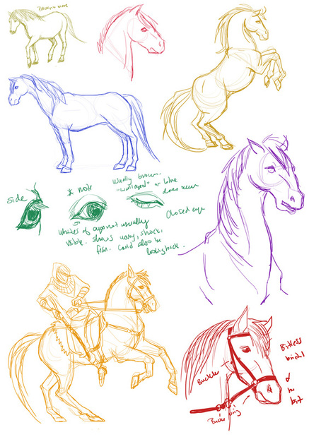 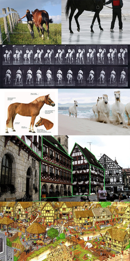 In the city scene second from bottom I used green lines to highlight the angles. I have been looking at tutorials on perspective and making cities look organic. Being able to see how this was at work in such a picture helped me draw the basic idea.
I decided to take part in a tournament-styled competition on Inkblazers.com. For this competition, everyone who entered was paired off with another comic artist. We read each other's work and design a character to fit within their universe. Judging criteria is based on art quality, design, and description (how well the character fits).
Winners from each bracket will proceed to the next and face a new competitor. I did something like this on Inkblazers several months ago, where competitors entered characters and each artist drew his/her own character with their opponent's character. I enjoyed it, and have been looking for another competition to do on inkblazers. It's a great way to get familiar with another artist's work, get feedback from talented artists, and to have more exposure for your own work. I will be posting sketches after reading the comic I have been assigned. By luck I already know of it, but it's quite detailed, so I want to be sure to create a plausible character. I will be designing a character for FixerTheWise with his webcomic, "Shapeshifter: A tale yet untold." As I said in the previous post, I like the load screens of Dragon Age II quite a bit. (I don’t know if they are different on PC; when I looked for images, I found a couple I had never seen while playing on PS3.) Here is an example of one of the load screen images. 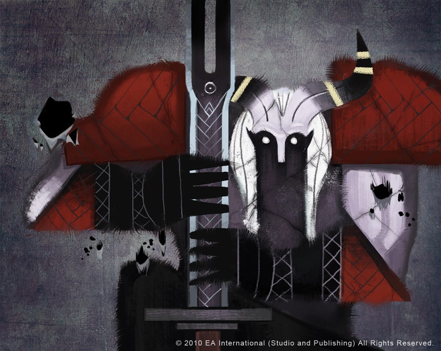 I tried to keep my illustration trial as simple as possible, allowing for the smallest amount of detail in the face and also the chainmail. The picture above has more linework, but I wanted to rely on silhouette ... or at least try it. A lot of my character illustrations are detail heavy, so it was difficult to keep it down to simple shapes to try and convey this character. I had to force myself to stay on track and just move ahead and see how it turned out; I decided if it went poorly I’d try again and allow my detail urges to be satisfied, and I would more clearly render the armor I’d drawn up in the sketches. In the end, I was pleasantly surprised with this trial. About an hour and a half, maybe two (as I was experimenting). Photoshop. 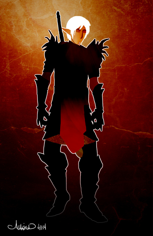 When that was done I added filters. I get mine from this user on deviantart.com: Sirius-sdz
When I added the top filter I ended up with some of his hair showing a bit, just this white line around the crown of his head. I decided to either erase it or run with it; so I ran. I incorporated it into the rest of the image, fading it out near the bottom. That layer is on luminosity to help with the glow effect. It was challenging yet relaxing to work with minimal shapes and colors. I want to try images of this sort for my own comic, but that’s for future trials – a few projects came up very suddenly and I must attend to them first, while keeping my comic updated. More on these projects next time! |
AuthorComic Artist Archives
December 2015
Categories
All
|
 RSS Feed
